
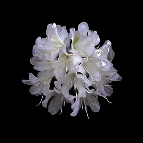
A blossom suspended against black does something ordinary floral art rarely does – it quiets the room and intensifies it at once. Blossom artwork on black background has a distinct visual authority: color appears richer, form feels more sculptural, and the bloom itself seems to emerge from shadow with almost cinematic force. For collectors, designers, and anyone shaping an interior with intention, that contrast is not merely decorative. It is atmospheric.
Unlike floral imagery that leans soft, sentimental, or overtly seasonal, blossoms on black hold a more enduring tension. They can feel sensual, still, dramatic, or contemplative depending on the treatment of color, motion, and detail. A petal edge lit against darkness can read as delicate from one angle and commanding from another. That duality is precisely what gives this category of wall art such lasting appeal in refined interiors.
Why blossom artwork on black background resonates
Black is often misunderstood in decorative art. Some see it as heavy, but in skillful composition it functions less as weight and more as depth. It creates visual space around the subject, allowing blossoms to breathe, glow, and gather presence. The result is not cluttered beauty, but distilled beauty.
This is one reason blossom artwork on black background feels so at home in both residential and professional spaces. In a living room, it can add intimacy and richness without becoming overly ornate. In a hospitality setting or executive office, it brings elegance with emotional nuance. The black field anchors the work, while the blossom introduces movement, sensuality, and color.
There is also an expressive advantage. Flowers photographed or reimagined against pale backgrounds often read as descriptive. Against black, they become interpretive. The image shifts from documentation to impression. The blossom is no longer simply shown – it is revealed.
The visual power of contrast
Strong art often depends on tension, and few combinations create tension more beautifully than luminous blossoms against darkness. Bright magentas, corals, creams, golds, or saturated reds take on heightened intensity when they are not competing with a busy setting. Black simplifies the composition while deepening emotional impact.
That simplification matters in interiors. Artwork does not live in isolation. It has to converse with upholstery, wood tones, stone, metal, and light. A blossom on black can hold its own in a layered room because its contrast gives it structure. It reads clearly from a distance, yet offers intricate rewards as you move closer.
This is also why such pieces work well at multiple scales. In a smaller format, the image feels jewel-like and concentrated. In a larger statement print, the blossom becomes immersive, almost architectural. The dark background supports both approaches by creating cohesion and focus.
More than floral decor
There is a difference between floral decor and floral fine art, and that difference often lies in interpretation. Decorative floral imagery tends to stop at prettiness. Fine art asks more of the image. It seeks mood, transformation, and a point of view.
With blossoms on black, the strongest works move beyond botanical accuracy. They may blur edges, exaggerate texture, intensify color, or use motion to suggest memory rather than specimen. This approach gives the blossom emotional reverberation. It feels less like an object collected from nature and more like an encounter with beauty in a heightened state.
That is where artist-driven work becomes especially compelling. When photography is fused with digital interpretation, the blossom can retain the authenticity of a lens-based image while gaining the expressive force of painterly abstraction. The result feels contemporary, collectible, and visually sophisticated without losing the immediacy that makes floral imagery so widely loved.
Where blossom artwork on black background works best
One of the great strengths of this style is versatility. It adapts to many interiors, though it never disappears into them. In a minimal room, it introduces emotional density and color without adding clutter. In a richly layered interior, it provides a moment of focus and visual calm.
Bedrooms are a natural setting because blossoms carry softness, while black introduces depth and intimacy. Dining spaces benefit from the quiet drama such work creates, especially under evening light. Entryways are another strong placement, since a blossom against black can establish a memorable first impression with immediate clarity.
For designers, these pieces are particularly useful where a room needs warmth but not sweetness. A blossom on black can soften modern architecture, sharpen a transitional scheme, or echo the richness of boutique hospitality interiors. In corporate or professional settings, it brings humanity and refinement without drifting into the expected language of generic office art.
Choosing the right piece for your space
Not every floral image on black will create the same effect, and this is where discernment matters. Some compositions are centered and symmetrical, which tends to feel formal and serene. Others crop tightly into petals and gesture, producing a more immersive and sensual result. Neither approach is universally better. It depends on the room and the kind of presence you want the artwork to hold.
Color temperature also changes the reading. White or pale blossoms on black can feel luminous and sculptural, almost meditative. Warmer blooms – crimson, orange, fuchsia, plum – introduce energy and emotional heat. If a space already contains strong material contrast, a quieter blossom may be enough. If the room feels restrained or overly neutral, a more saturated piece can animate it beautifully.
Texture matters as well. Crisp detail lends elegance and clarity. More impressionistic treatment introduces movement and atmosphere. Arthur Jacob Impressions, for example, approaches floral and blossom imagery as visual transformation rather than literal record, which gives the work a gallery sensibility suited to collectors and design-led interiors alike.
The role of scale and presentation
Scale changes everything with this subject. A single blossom rendered large can feel almost monumental, allowing subtle shifts of tone and texture to become part of the room’s architecture. Smaller works can be grouped for rhythm, especially if they share a tonal palette or move between related blossom forms.
Black-ground florals also pair well with multi-panel formats when the image has enough visual sweep. Diptychs and triptychs can extend the blossom’s motion across a wall, creating an experience that feels expansive rather than merely decorative. That said, some blooms are strongest when isolated. Their impact comes from concentration, not repetition.
Presentation should support the artwork’s character rather than compete with it. Clean framing often suits these pieces because the image itself already contains drama. The dark field provides its own edge, its own sense of enclosure. What matters most is preserving the artwork’s depth and allowing the blossom to remain the focal event.
Why collectors return to this imagery
Blossoms have been depicted for centuries, yet they continue to feel alive in contemporary art because they carry both immediacy and symbolism. They suggest transience, renewal, sensuality, fragility, and strength – sometimes all within a single image. Against black, those associations sharpen. The blossom seems to emerge from silence, from memory, from the unknown.
That is part of what makes this kind of work easy to live with over time. It is visually striking on first encounter, but it also deepens with repetition. Morning light brings one reading. Evening light brings another. A bloom that first appeared dramatic may later feel meditative. A piece chosen for its color may stay for its emotional gravity.
For art buyers who want more than mass-market decoration, this category offers something rare: accessibility without predictability. The subject is recognizable, but the experience can be profoundly individual. A successful piece does not simply match a room. It alters the way the room is felt.
The best blossom artwork on black background does exactly that. It turns contrast into atmosphere, floral form into presence, and a familiar subject into something quietly unforgettable. When a piece achieves that balance, it does not just fill wall space. It gives the room a pulse.