
A room can be beautifully furnished and still feel unfinished until art gives it a point of view. The most compelling fine art print trends are moving beyond passive decoration toward work that creates atmosphere: color with emotional force, imagery with tactile presence, and compositions that invite a second look. For collectors and designers alike, the appeal lies in artwork that does more than fill a wall. It changes the emotional temperature of the space.
This shift has brought renewed attention to artist-driven prints that reinterpret what the eye recognizes. Photography, digital transformation, abstraction, and painterly gesture increasingly meet within a single image. The result is wall art that feels immediate enough for contemporary interiors yet layered enough to live with over time.
Fine Art Print Trends Are Becoming More Expressive
A strong current in contemporary print collecting is the move away from literal representation. A photograph of a flower, landscape, or fleeting human moment may begin in reality, but the finished work is often shaped by color, texture, blur, repetition, and altered light. The image becomes an impression rather than a record.
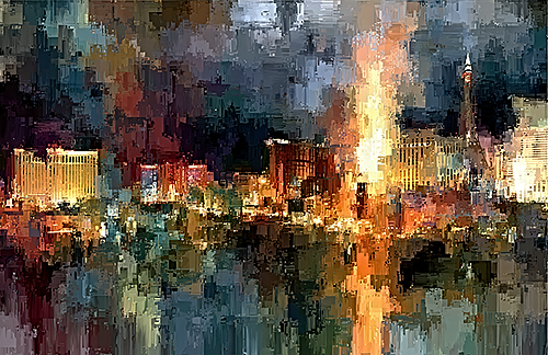
That distinction matters. Conventional photography can document a subject with precision; transformed photographic art can reveal its mood. A blossom rendered against a deep black field, for example, takes on a theatrical intensity. A familiar city scene softened into bands of light may evoke memory more than place. These works offer viewers room to bring their own associations to the image.
For interiors, this expressive quality makes art more adaptable. A piece need not match every material or finish in a room to belong there. Its visual energy can provide contrast to tailored furnishings, warmth to minimalist architecture, or a sense of motion within a quiet, neutral palette.
Color Is Taking a More Confident Role
Muted interiors still have a place, especially where architecture, natural materials, or collected antiques carry much of the visual story. Yet many designers are using art as the decisive moment of saturation. Vivid blues, luminous reds, electric greens, and concentrated golds are appearing not as accessories, but as focal points with genuine visual authority.
This is not color for color’s sake. In the strongest work, color is structural. It directs the eye, creates rhythm, and gives an image its emotional charge. A richly colored abstract can establish movement across a large wall; a floral print can introduce a sensual note without becoming overly decorative. The distinction is in the composition – whether the color feels intentional, dimensional, and alive.
For a collector, the question is less “Will this color match?” and more “What does this color make the room feel like?” A vivid work can bring clarity and exhilaration to an entry, intimacy to a dining space, or contemplative depth to an office. The effect depends on scale, surrounding light, and the artwork’s own visual density.
Tactile Depth in a Digital Age
As more aspects of visual life are experienced through screens, prints with visible texture hold particular appeal. Grain, layered marks, softened edges, high-contrast shadows, and painterly surfaces give an artwork a physical presence that cannot be fully conveyed by a small digital image.
This does not require an image to imitate a painting. Rather, it asks the artist to use the possibilities of digital manipulation with discernment. When lens-based imagery is pushed through an imaginative process, it can retain the authenticity of an observed moment while gaining the complexity of a constructed artwork. A click becomes a vision and impression.
Tactile visual language is especially resonant in interiors with clean lines. In a modern setting of glass, stone, and metal, a print with layered texture can relieve the perfection of the architecture. In a more traditional space, it can create a fresh counterpoint without disrupting the room’s established character.
The trade-off is worth considering. Highly textured or visually intricate work needs room to breathe. If a wall already carries patterned textiles, elaborate millwork, or numerous decorative objects, a quieter image may create a more balanced result. Expressive art is powerful precisely because it asks to be seen.
Black Grounds and Dramatic Contrast
Dark-background florals and botanical imagery are among the most enduring directions in fine art prints because they bring an uncommon combination of elegance and drama. Against black or near-black, petals, stems, and bursts of color appear suspended in space. The subject gains sculptural presence, while the darkness introduces a sense of mystery.
These works are especially effective in rooms that need visual depth. In a light-filled dining room, a black-ground floral can anchor the wall and create evening drama after sunset. In a bedroom, it can feel intimate and enveloping. In hospitality or professional settings, it offers a memorable focal point that feels refined rather than generic.
The success of this approach depends on nuance. A dark image is not necessarily heavy. When light, color, and negative space are thoughtfully composed, it can feel luminous, even airy. It is this tension between darkness and radiance that gives the work its emotional reverberations.
Multi-Panel Art Creates Rhythm and Scale
Diptychs and triptychs continue to attract attention because they allow an artwork to unfold across the wall. Rather than treating a large area as a single blank field, multi-panel work introduces pacing. The space between panels becomes part of the composition, creating a visual pause that can feel architectural.
A diptych is often ideal where symmetry matters: over a console, behind a dining table, or along a broad hallway. A triptych can create a more expansive, cinematic effect above a sofa, bed, or reception seating. In each case, the imagery should feel connected without becoming repetitive. A shift in color, gesture, or perspective across panels gives the viewer a path to follow.
This trend also reflects a broader desire for art that can shape an entire environment. One substantial multi-panel work may carry more presence than several unrelated smaller pieces. That said, scale should be chosen in relation to the wall, not merely the furniture beneath it. A composition that is too small can disappear; one that is too crowded can lose its rhythm.
Collectors Want a Distinct Artistic Hand
The market for fine art prints is increasingly defined by discernment. Buyers are looking for work that bears evidence of an artist’s sensibility – a recognizable approach to form, color, subject, and transformation. They want to feel that an image came from a particular way of seeing, not from an interchangeable visual formula.
This is why artist-led photographic and digital work resonates so strongly. It occupies a fertile place between photography and painting, observation and imagination. Arthur Jacob Impressions reflects this approach through images that begin with the visible world and move toward something more interpretive: florals that pulse with color, abstractions that suggest motion, and remembered scenes reassembled through expressive form.
Originality does not mean a work must be difficult or obscure. The most lasting prints often offer an immediate sensory response while continuing to reveal new relationships over time. A viewer may first respond to a wash of color, then notice a delicate edge, an unexpected shadow, or a gesture hidden in the composition. That ongoing discovery is part of what makes art collectible.
Designing With Art Rather Than Around It
One of the most useful shifts in contemporary interiors is to select art early, rather than treating it as the final decorative decision. A significant print can establish the room’s emotional vocabulary. From there, textiles, lighting, and accent materials can respond to the artwork’s palette or mood without copying it too literally.
In a residential setting, this might mean allowing a single energetic abstract to lead a restrained living room, or choosing a luminous floral work to soften a room of sculptural furniture. In an office or hospitality environment, art can define the visitor’s first impression – adding personality, calm, or momentum where branded surfaces alone may feel impersonal.
There is no universal rule that art must coordinate perfectly. Some of the most memorable rooms use deliberate contrast: a vivid contemporary print in a historic interior, a moody botanical against pale plaster, or a gestural image beside crisp, rectilinear furnishings. What matters is that the work feels chosen, not merely placed.
The best direction among current fine art print trends is not a single color, subject, or format. It is the return to art with conviction – work that carries a distinct visual voice and gives a room something lasting to feel.
Leave a Reply