
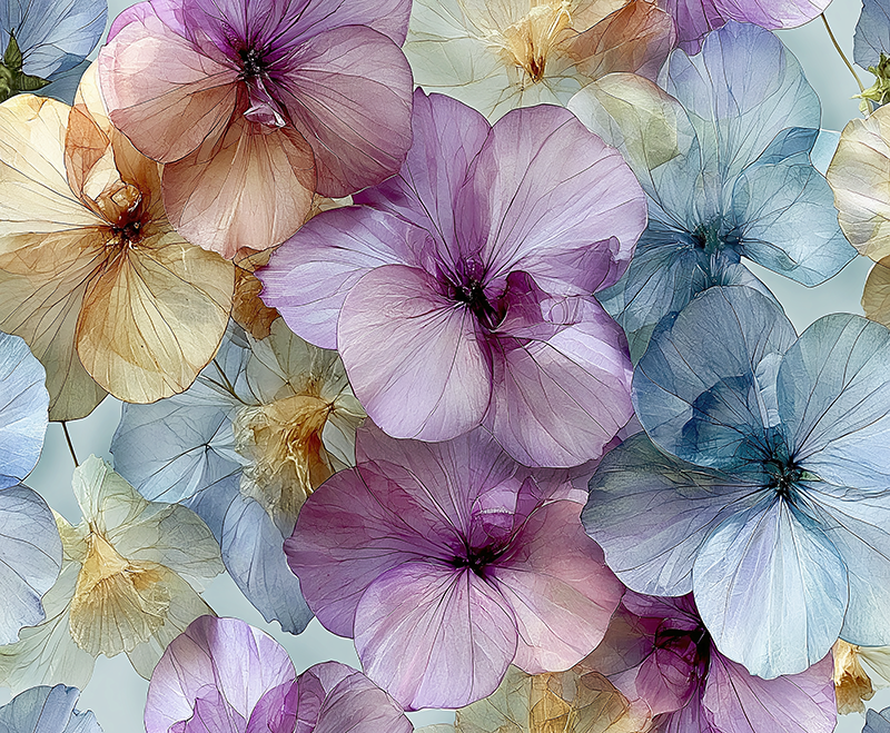
A room can be beautifully appointed and still feel unfinished until color gives it a pulse. That is why color trends in purchasing fine art prints are less about following a passing shade and more about choosing an atmosphere that lingers. The right print can make a quiet interior feel luminous, sharpen the character of a contemporary space, or bring a deeply personal note to a room designed with restraint.
For collectors and design-minded buyers, color is often the first invitation. Before the eye studies texture, technique, or subject, it recognizes a wash of cobalt, a field of coral, a deep black ground pierced by blossoms, or the softened radiance of a remembered landscape. In fine art, that immediate response is not superficial. It is the beginning of a relationship with the work.
Color Trends in Purchasing Fine Art Prints
The most compelling direction in fine art interiors is not a single color of the year. It is a movement toward emotional palettes: colors that create a sensory experience rather than merely coordinate with a sofa or wall finish. Buyers are selecting art that offers visual distinction, but they are also looking for work with enough depth to remain engaging long after the room is complete.
Earth-based neutrals continue to provide a strong foundation. Clay, warm sand, smoke, olive, weathered blue, and softened umber feel composed without becoming timid. In a residential setting, these tones can create an immediate sense of ease. In offices and hospitality spaces, they introduce warmth where architectural materials may otherwise feel cool or impersonal.
Yet neutral does not have to mean quiet. A print built from layered tones, tactile surfaces, and subtle shifts in light can hold a wall with remarkable authority. The distinction lies in complexity. A flat beige image may disappear, while a composition that moves through cream, gold, charcoal, and shadow can feel contemplative, sculptural, and alive.
At the other end of the spectrum, saturated color remains irresistible for buyers who want art to become the room’s visual center. Jewel tones, vivid blues, vermilion, magenta, citron, and electric violet are appearing as confident gestures within otherwise edited interiors. These hues are especially powerful when they are shaped by motion and texture rather than presented as a simple block of color. They feel expressive instead of decorative.
The Return of Dark Grounds
Black and near-black backgrounds have become particularly resonant in fine art print selection. They provide contrast, drama, and a sense of depth that lighter walls often welcome. Against a dark field, a flower, a burst of color, or a fragment of light can appear suspended in space. The effect is both intimate and theatrical.
This is one reason floral and botanical imagery on black continues to speak to collectors. It takes a familiar subject and gives it heightened presence. A blossom is no longer just observed; it becomes an event of color, form, and atmosphere. In a dining room, entry, bedroom, or boutique hospitality setting, such work can create the memorable pause that polished interiors need.
Dark-ground art does require attention to placement. In a room with limited natural light, one expansive print with luminous color may be more effective than several smaller, heavily shadowed works. In a bright white space, however, dark compositions can provide precisely the contrast that prevents the room from feeling sterile.
Choose Mood Before Matching Colors
One of the most useful shifts a buyer can make is to stop asking, “What color will match?” and begin asking, “What do I want to feel here?” Matching has its place, especially when an interior has a carefully defined palette. But art chosen only to repeat existing colors can become visually obedient. It may coordinate perfectly and say very little.
Mood leads to more enduring choices. A soft, atmospheric print can bring restoration to a bedroom or reading area. A composition with energized marks and vivid movement can give a living room, creative studio, or reception space momentum. Work that balances rich color with open areas of light can lend sophistication to a professional interior without draining it of personality.
Consider the existing room as a conversation rather than a rulebook. If the furnishings are quiet, art may introduce the surprise. If the space already contains strong pattern or color, a more restrained print can create a necessary place for the eye to rest. Harmony is not always repetition. Often, it is the tension between elements that allows each one to become more visible.
Warmth, Coolness, and Emotional Temperature
Color has an emotional temperature, and it changes how a space is perceived. Warm tones such as red, orange, yellow, and rose tend to advance visually. They can make a large room feel more intimate and bring energy to areas built for gathering. Cool tones such as blue, green, indigo, and violet often recede, suggesting calm, distance, reflection, or expansive air.
Neither direction is inherently better. A collector drawn to cool blue abstractions may be responding to their quiet spaciousness. Another may choose a radiant red or gold composition because it feels celebratory and immediate. The finer question is whether the emotional temperature serves the room and the people who inhabit it.
Mixed palettes offer another possibility. The meeting of warm and cool color can make a print feel especially dynamic, as if light were moving across its surface. This interplay is central to artwork that transforms photographic origins into something more impressionistic and imaginative. Reality becomes a starting point, then color carries it into a more expressive realm.
Why Tonal Range Matters More Than Trend
A print with lasting presence rarely depends on one fashionable hue alone. Its strength often comes from tonal range: the passage from light to dark, saturated to muted, sharp to dissolved. This range gives an image depth, allowing it to reveal different details at different times of day.
Morning light may bring forward a pale accent or delicately layered texture. Evening illumination may deepen the shadows and intensify a single saturated note. That capacity for change is part of what makes fine art rewarding to live with. The work does not remain static simply because it hangs in one place.
When viewing a potential print, look beyond its dominant color. Notice whether it contains small visual bridges to the room: a trace of charcoal that speaks to a metal fixture, a softened green that echoes nearby foliage, a cream highlight that relates to linen or wood. These connections help a bold work feel at home without reducing it to an accessory.
Scale also affects color. A vivid composition in a small format can feel like a concentrated jewel. In a large format, the same palette may alter the entire atmosphere of a room. Diptychs and triptychs extend that effect, creating rhythm across a wall and allowing color to unfold in sequence. They are especially effective over long furniture, in corridors, or in spaces where one single image would feel too contained.
Collect What Continues to Call You Back
Trends can offer language for what buyers are seeing in interiors, but they should never replace instinct. The most successful fine art print is often the one that holds attention after the first burst of color has settled. It should reward a second look with gesture, texture, subtle form, or an unexpected shift in light.
At Arthur Jacob Impressions, color is not used as a surface treatment. It is part of the transformation: a way for a photographed moment to become an impression charged with motion, memory, and feeling. That distinction matters to those seeking art with both decorative power and a more lasting emotional resonance.
Bring a few images of the intended space when considering a print, but leave room for the work to surprise you. The piece that introduces an unexpected blue, a fearless bloom of red, or a dark field alive with light may be the one that gives the room its truest identity.
Leave a Reply