
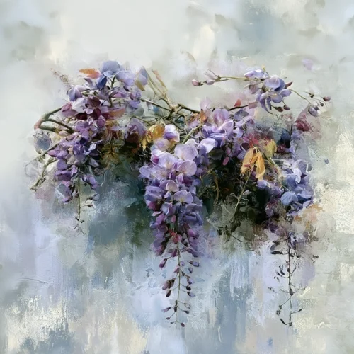
A wall piece can arrive with extraordinary color, tactile depth, and a presence that changes the atmosphere of a room. Yet the language surrounding prints can feel less clear than the image itself. The giclee vs fine art print question is not really about choosing one level of beauty over another. It is about understanding what a print is, how it was made, and whether its physical form honors the artist’s visual intention.
For collectors and design-minded buyers, that distinction matters. A print should do more than fill a wall. It should hold its color, reward a closer look, and carry the same emotional reverberation that first made the work impossible to overlook.
Giclee vs Fine Art Print: The Essential Difference
A giclée is a particular kind of inkjet print. The word comes from the French verb gicler, meaning “to spray,” a reference to the fine droplets of ink placed on paper or canvas by a high-resolution printer. In contemporary art publishing, giclée usually describes a print made with pigment-based inks on a carefully selected, archival-quality substrate.
A fine art print is a broader term. It describes an artwork produced as a print and presented with artistic, rather than merely decorative or commercial, intention. A fine art print may be a giclée, but it can also be a traditional darkroom photograph, a screen print, an etching, a lithograph, or another editioned work created through a hands-on printmaking process.
In other words, giclée names a printing method. Fine art print names an artistic category and standard of presentation. The two terms often overlap, but they are not interchangeable.
That distinction frees buyers from a misleading assumption: one word does not automatically signal greater value than the other. The quality of a work comes from the complete relationship between image, artist, materials, production, and care.
Why the Printing Method Still Matters
Giclée printing became popular with artists because it can translate nuanced imagery with remarkable sensitivity. It is especially well suited to photographic and digitally composed artwork, where subtle shifts in color, layered texture, translucent light, and finely rendered detail are central to the experience.
Pigment inks are prized for their ability to produce a broad tonal range. Deep blacks can feel velvety rather than flat. Saturated florals can retain their intensity without becoming harsh. In an expressive abstract, small transitions between color fields can remain visible, preserving the sensation of motion and atmosphere within the original composition.
The paper or canvas matters just as much. A smooth matte paper may emphasize crisp detail and luminous color. A textured cotton rag sheet can introduce a softer, more tactile character, allowing an image to feel almost painterly. Canvas can create a more sculptural presence, particularly at larger scale, though it will interpret detail differently from fine art paper.
None of these materials is universally best. A work built on intricate photographic detail may sing on smooth paper, while an image shaped by gestural texture or painterly digital manipulation may gain depth on a lightly textured surface. The right choice supports the image rather than competing with it.
Fine Art Is More Than a Technical Label
A high-quality printer can produce a beautiful giclée, but technology alone does not create fine art. The artistic dimension begins much earlier, in the way the image is seen, transformed, and resolved.
Fine art photography, for example, is not confined to recording a scene exactly as it appeared. The artist may alter scale, layer exposures, intensify color, soften edges, or recompose the image until reality becomes something more interior and evocative. What began as a click of the shutter becomes a vision and impression: a visual language shaped by memory, emotion, and imagination.
This is where artist involvement becomes meaningful. A fine art print should reflect choices about color, contrast, texture, cropping, and substrate. Ideally, the artist has proofed the image and approved the final result, so that the print is not simply a file reproduced at random but an authored object. The finished piece carries a deliberate interpretation of the work.
At Arthur Jacob Impressions, photographic source material is reimagined through digital transformation, creating imagery that moves beyond documentation. The final print is intended to preserve that fusion of lens-based observation and expressive form, so color and movement retain their full visual force in a curated interior.
What to Look for Beyond the Word “Giclee”
Because giclée is widely used in the art world, it can sometimes be treated as a shortcut for quality. It should not be. There is no single universal standard governing how the word is used. One seller may use it to describe a carefully color-managed pigment print on museum-quality cotton paper; another may use it more loosely for almost any inkjet reproduction.
Instead of relying on the label alone, consider the complete presentation. Ask what type of ink is used, whether the paper or canvas is selected for archival performance, and whether the image has been professionally proofed. Look closely at the reproduction itself. Are shadow areas rich rather than muddy? Do colors feel dimensional? Are fine details resolved without appearing artificially sharpened?
Edition information can also offer useful context. Some fine art prints are released in limited editions, while others are open editions. Neither approach automatically determines artistic merit. A limited edition may appeal to collectors who value a defined number of impressions, while an open edition can allow an artist’s work to remain available to a wider audience. What matters most is clarity, consistency, and an honest description of what is being offered.
A signature or certificate may further document the relationship between the artist and the print, though these details should be understood as part of the work’s provenance rather than substitutes for visual quality. The image itself remains the heart of the piece.
How Materials Shape a Room
For interior designers and homeowners, the giclee vs fine art print conversation also has a practical dimension. A print’s surface can influence how a room receives it. Matte paper absorbs light gracefully and often feels intimate, sophisticated, and calm. A more reflective finish may heighten contrast and vibrancy, but it can also react more strongly to nearby windows and lighting.
Consider the setting before selecting a finish or presentation. In a sunlit living room, a darker blossom against a black ground can create a dramatic anchor, while a luminous abstract may bring movement to a more restrained space. In a hospitality setting or professional office, a diptych or triptych can establish rhythm across a long wall, allowing color to unfold from panel to panel.
Scale is part of the experience as well. Small works invite intimacy. Larger pieces can alter a room’s center of gravity, turning an ordinary wall into a focal plane. The most successful selection is rarely about matching every color already in the room. It is about finding a work with enough emotional and visual conviction to make the whole space feel more intentional.
Preservation Is a Shared Responsibility
Even the finest pigment print deserves thoughtful care. “Archival” refers to materials designed for stability under appropriate conditions, not a promise that a print is untouched by time, sunlight, humidity, or handling. Direct, intense light can alter any artwork over the years, and unprotected surfaces are more vulnerable to dust, abrasion, and environmental shifts.
Professional framing with acid-free materials and UV-filtering glazing can help preserve paper prints while elevating their presentation. Canvas has different needs, but it also benefits from being placed away from extreme heat, moisture, and persistent direct sun. Care is not merely protective. It allows the work’s color, depth, and quiet subtleties to remain present for years of looking.
The best choice is the one that lets the artwork speak with clarity. Read the process, inspect the materials, and then trust your response to the image. When a print continues to draw the eye from across the room and reveal something new at close range, it has already become more than a reproduction. It has found its place in your visual life.
Explore the Original Fine Art Prints created by Arthur Jacob
Leave a Reply