
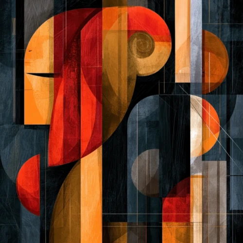
A room can be beautifully furnished and still feel unfinished. Often, what is missing is not another object but a visual presence: an image with enough energy to gather the room around it. Color driven abstract wall art answers that need with a language more immediate than subject matter. It does not ask the viewer to recognize a place or a person first. It asks them to feel a pulse of cobalt, a flare of crimson, a wash of luminous gold, or the quiet gravity of black.
For collectors and design-minded homeowners, this distinction matters. Color is not merely decorative. It establishes atmosphere, directs the eye, and creates an emotional temperature within an interior. When abstraction is guided by color with intention, a wall becomes more than a backdrop. It becomes part of the experience of the space.
Why Color Carries an Abstract Image
Abstract art can be misunderstood as art without reference. In its strongest form, however, abstraction is full of reference: to motion, weather, memory, light, rhythm, and the sensations that resist literal description. Color is often the element that makes those references felt rather than explained.
A field of saturated blue may suggest distance, stillness, or the coolness of evening. A sudden note of orange can introduce heat and motion. Layered passages of violet and charcoal may hold a more contemplative mood, while high-key pinks, yellows, and greens can make an interior feel awake and expansive. None of these responses is fixed. That is part of the work’s appeal. The image leaves room for a personal reading while retaining a clear visual force.
This is why color-driven work has such decorative intelligence. It can speak directly to a room’s existing palette, but it does not need to match every fabric or finish to belong there. A compelling print may echo one small accent in the room, challenge a neutral scheme, or introduce a fresh visual current that changes how familiar furnishings are seen.
Color Driven Abstract Wall Art as a Focal Point
The most successful statement art does not simply fill an empty wall. It creates a center of gravity. In a living room, it can organize the conversation area and give a sofa, chairs, and rug a shared visual destination. In an entryway, it can set the emotional tone before a guest has taken more than a few steps. In an office or hospitality setting, it can bring energy and individuality to spaces that might otherwise feel impersonal.
Scale is part of that impact. A larger work with broad, confident color can make a spacious wall feel intentional rather than vacant. It can also give a compact room a sense of depth, provided the composition has enough openness to breathe. Conversely, a smaller print can carry remarkable intensity when placed where the eye naturally pauses: above a console, within a reading corner, or at the end of a hallway.
The trade-off is visual competition. If a room already contains a patterned rug, heavily veined stone, richly colored upholstery, and numerous decorative objects, the artwork needs a disciplined composition or a more restrained palette. A vivid piece can still work beautifully there, but it should bring order rather than add another layer of noise. In quieter interiors, a work of high chromatic energy often becomes the room’s essential spark.
Choose a Mood Before Choosing a Color
It is tempting to begin with the question, “What colors are in the room?” A more revealing question is, “How should this room feel?” The answer will guide the palette more effectively than matching alone.
For a composed, restorative atmosphere, look toward blues, mineral greens, softened neutrals, and tonal layers that reward lingering attention. For spaces meant to feel sociable and alive, warmer notes of red, coral, amber, or bright yellow can create an immediate sense of invitation. Dark grounds paired with vivid color offer another possibility: drama with precision. They are especially effective in interiors that favor contrast, sculptural lighting, and a more cinematic sense of atmosphere.
The point is not to assign a single emotion to each hue. Color is relational. A red mark surrounded by pale gray behaves differently than red against deep black. A brilliant blue becomes more electric when touched by orange, and more meditative when surrounded by silvered whites. The power of an abstract work often lives in these relationships, where colors push, recede, and reverberate across the surface.
The Value of Movement and Texture
Color gains dimension when it is carried by gesture, texture, and visual movement. A photograph transformed through digital manipulation can hold traces of the observed world while moving beyond documentation. Light may become a streak, a flower may dissolve into a cloud of pigment-like form, and a familiar landscape may become an impression of motion and memory.
That transformation gives the work its staying power. A purely decorative color block may make an instant impression, but an image with layered detail reveals something new as daylight shifts or as the viewer returns to it over time. The eye follows a line, notices a submerged shape, or encounters a quiet passage within an otherwise radiant field.
At Arthur Jacob Impressions, this exchange between lens-based imagery and expressive reinterpretation is central to the visual language. The resulting prints are not conventional photographs presented as décor. They are impressions: works in which a captured moment becomes an imagined experience, shaped by color, texture, and an intuitive sense of composition.
Consider the Light Around the Artwork
The same print can feel dramatically different from morning to evening. Natural light may reveal subtle tonal shifts and fine detail, while evening illumination can concentrate the work’s color and heighten its theatrical presence. Before selecting a piece, consider the wall’s relationship to windows, lamps, and overhead lighting.
A sun-filled room can support cooler or more nuanced palettes that might feel subdued elsewhere. A darker room may benefit from brighter color, reflective passages, or a composition with enough contrast to remain articulate after sunset. Direct glare, however, can flatten an image and interrupt its surface rhythms. Positioning and lighting deserve as much attention as color selection itself.
Single Works, Diptychs, and Triptychs
A single large-scale image offers immediacy. It has the authority of one complete visual event, particularly above a mantel, bed, or long console. But multi-panel art introduces a different kind of movement. A diptych creates a conversation across two surfaces, while a triptych can extend a visual rhythm along a wider wall.
These formats are especially compelling when color appears to travel from one panel to the next. The intervals between panels become part of the composition, creating pauses that give the work a measured, architectural quality. In a long corridor, above a dining sideboard, or across an expansive office wall, this structure can feel both contemporary and deeply considered.
There is no universal rule for choosing between them. A single image is often best when the room needs one decisive gesture. Multiple panels are valuable when the wall itself has breadth and the interior can benefit from a slower, unfolding experience. The choice depends on proportion, sightlines, and the emotional pace of the room.
How to Let the Art Lead the Room
When a color-driven abstract print is truly distinctive, it does not need excessive explanation from the rest of the interior. Give it enough visual space to register. Avoid crowding it with many small objects or competing frames. Let the colors find subtle companions in a pillow, a ceramic vessel, a book spine, or a flowering branch, rather than repeating them everywhere.
This restraint allows art to feel collected rather than coordinated. It also makes room for contrast. A vivid, gestural print can look striking against tailored furniture and clean architectural lines. A darker, more atmospheric work can bring depth to pale walls and natural materials. The conversation between art and interior is often most memorable when the elements are not identical, but responsive to one another.
Color-driven abstraction offers something increasingly rare in a furnished world: an image that can alter the emotional register of a room without dictating a single story. Choose the work that keeps drawing your eye back, then give it a wall, a light, and a little breathing room worthy of its presence.
Leave a Reply