
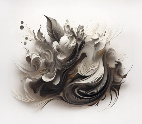
A room can be beautifully furnished and still feel unfinished. Often, the missing element is not another object but an image with enough presence to gather the room around it. The distinction between fine art prints vs posters matters here because the choice shapes more than the wall. It shapes the atmosphere, emotional register, and visual memory of a space.
A poster can be lively, graphic, and entirely right for a particular moment. A fine art print, however, is generally chosen for a different kind of relationship: one rooted in an artist’s vision, attentive production, and an image that continues to reveal itself over time. For collectors and design-minded homeowners, this difference is less about rules than about intention.
Fine Art Prints vs Posters: The Essential Difference
At their core, posters are commonly designed for broad reproduction and immediate visual impact. They may feature famous images, typography, film stills, travel graphics, illustrations, or artwork reproduced for decorative use. Their appeal often lies in accessibility and recognizability. A poster can introduce color, personality, or cultural reference with a direct, uncomplicated gesture.
Fine art prints begin with an artist’s authorship. The image is created as an artwork, whether it originates in photography, painting, drawing, or a digitally composed process. It is then reproduced with close attention to the character of the original vision: tonal range, surface, color relationships, detail, and intended scale. The print is not simply an image placed on paper. It is the physical expression of an artistic point of view.
That distinction can be especially meaningful in photographic and digitally transformed work. A photograph may begin with a recognizable subject – a blossom, a landscape, a passing moment of light – and become something far more interpretive through composition, color, gesture, texture, and digital manipulation. The finished image invites viewers to feel rather than merely identify what they see.
Still, the categories are not absolute. Some artist-made posters are visually compelling and thoughtfully produced. Some fine art prints are released in open editions. The most useful question is not whether a label sounds more prestigious. It is whether the work carries an authentic visual language and has been produced in a way that honors it.
Authorship Changes What You See
When selecting art for an interior, authorship is often the quiet force behind a work’s staying power. A poster may reproduce an image that is already familiar to millions of people. A fine art print offers an encounter with a specific artist’s way of seeing.
That way of seeing can transform an ordinary subject. A flower becomes an atmosphere of saturated color. Moving water becomes a field of luminous abstraction. Architectural detail becomes rhythm and geometry. The image no longer functions only as documentation. It becomes an impression – a place where observation and imagination meet.
This is why artist-driven prints can hold their own in interiors where every material has been chosen with care. They do not merely fill a blank wall or repeat the palette of the sofa. They introduce a perspective. In a restrained room, a vivid abstract can become a pulse of energy. In a contemporary office, a multi-panel work can create movement across a long wall without overwhelming the architecture. In a bedroom, florals or memories rendered with softness and depth can establish a more intimate emotional temperature.
For collectors, authorship also creates continuity. As one work leads to another, a collection begins to reflect a recognizable sensibility rather than a series of disconnected decorative choices.
Paper, Ink, and Surface Are Part of the Artwork
The visual difference between a poster and a fine art print is often most apparent at close range. Fine art printing is typically approached as a craft. The artist or publisher considers the paper’s weight and surface, the behavior of the inks, the density of black, the delicacy of highlights, and the fidelity of subtle transitions.
This is particularly important for work built on color and texture. A black background can appear velvety and dimensional rather than flat. A wash of cobalt, coral, or gold can retain its inner variation. Fine lines and layered marks can remain articulate, allowing the viewer to move closer and discover a second experience within the image.
Posters are often printed on lighter stock with a finish selected for efficient reproduction. That does not make them without merit. For a temporary installation, a playful graphic moment, or a casual personal space, their clarity and informality may be exactly the point. Yet they can feel visually thinner when placed beside refined furnishings, natural materials, or carefully considered lighting.
A fine art print tends to reward duration. Its surface, depth, and color are designed to be lived with. Morning light may bring forward one set of tones; evening light may reveal another. This changing relationship is part of the pleasure of art in a home or professional setting.
Color Fidelity and Emotional Resonance
Color is not a decorative afterthought in a fine art print. It is a carrier of mood. The difference between a red that feels merely bright and one that feels molten, floral, or cinematic can alter an entire room.
When an artist works through a calibrated print process, color can preserve the emotional charge of the original composition. Deep shadows retain nuance. Brilliant areas remain alive rather than harsh. Transitional tones create movement, allowing the eye to travel through the image instead of stopping at its surface.
This matters in hospitality spaces, lobbies, studios, and residences alike. Art becomes part of the sensory architecture of the room. It can quiet the eye, ignite it, or create a point of focus that draws people inward.
Editioning, Intention, and Collectibility
Fine art prints are frequently available as limited editions, though not every fine art print is limited. Editioning can give a work a defined place within an artist’s practice, often accompanied by details such as a signature, edition number, title, or certificate. These elements connect the object on the wall to the artist’s larger body of work.
Collectibility, however, is not only about scarcity. It is also about coherence, originality, and the sense that an image belongs to a sustained creative vision. A print becomes more resonant when it feels like one expression within a larger world of images – perhaps an exploration of blossoms against black, gestural abstractions, or a sequence designed as a diptych or triptych.
For interior designers, this opens up useful possibilities. A single statement piece can anchor a room, while related works can carry a visual thread from entry to living area or through a hospitality environment. Multi-panel art is especially effective when a wall calls for breadth and rhythm rather than one isolated focal point.
Posters can certainly be framed and displayed with care. But when the goal is to build an art collection, establish a distinctive design narrative, or bring a gallery-like presence into a room, fine art prints tend to offer more depth to work with.
How to Choose the Right Work for Your Space
Begin with the feeling you want the room to hold. If you are creating a relaxed, playful corner or an evolving gallery wall of cultural references, a poster may be a natural choice. It can speak quickly and bring a welcome note of spontaneity.
If you are looking for an image that can become part of the identity of the space, consider a fine art print. Look for work that keeps your attention after the first glance. Notice whether the composition has movement, whether the colors feel intentional, and whether the subject opens into something more evocative than literal.
Scale should also follow the architecture of the wall. A small print can be intimate and jewel-like when given room to breathe. A larger work can establish a commanding visual center. Diptychs and triptychs are valuable when you want to extend an image across a wall while preserving an elegant sense of pacing.
Framing deserves equal consideration. The right frame should not compete with the art. It should give the work definition, protect it, and relate naturally to the room’s materials. A refined frame and thoughtful placement can elevate both a poster and a print, but fine art prints often possess the surface complexity and visual depth that make framing feel like an integral final gesture.
The Work That Remains
The most meaningful wall art does more than match a color scheme. It creates a pause. It gives a room its own atmosphere and gives the people within it something to return to.
When weighing fine art prints against posters, allow the room to tell you what it needs. Choose the poster when immediacy, playfulness, or a familiar visual reference serves the moment. Choose the fine art print when you want an artist’s imagination to remain in the room – shifting with the light, deepening with time, and leaving its own emotional reverberation long after the first impression.