
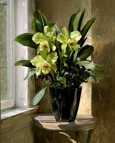
A wall can be beautifully painted, thoughtfully furnished, and still feel unfinished when the art is too small for its surroundings. The eye reads scale before it reads subject. This guide to selecting art scale begins there: with the understanding that a print is not merely placed on a wall, but allowed to shape the atmosphere of the room around it.
A vivid floral can become the pulse of a quiet entry. An abstract rich with movement can give a restrained living room its necessary spark. Yet even the most compelling image loses some of its force when it is undersized, crowded, or hung without regard for the architecture beneath it. Choosing scale is the act of giving art enough visual air to make an impression.
Start With the Wall, Not the Empty Space
It is tempting to measure only the blank portion of a wall. A more discerning approach considers the wall as part of a complete composition: the furniture below it, the ceiling above it, nearby windows, doorways, molding, and the room’s sightlines.
A generous, uninterrupted wall can hold a large statement piece without feeling overdone. In fact, one substantial work often feels calmer and more intentional than several small images scattered across a broad surface. The artwork becomes a focal point rather than a collection of interruptions.
Conversely, a narrow wall between architectural features asks for restraint. Choose a vertical work that follows the wall’s proportion, or a smaller composition that leaves a visible border around the art. The goal is not to fill every available inch. It is to create a relationship between image and structure that feels composed.
Before committing to a size, use painter’s tape or kraft paper to mark the artwork’s outer dimensions on the wall. Live with that outline for a day or two. Notice it from the doorway, from a seated position, and in changing light. This simple exercise reveals whether the piece will command the room or disappear into it.
A Guide to Selecting Art Scale Above Furniture
Furniture provides one of the clearest visual anchors for art. Above a sofa, credenza, console, headboard, or dining sideboard, the artwork should feel connected to the piece below rather than floating apart from it.
As a general rule, art or a grouped arrangement looks most balanced when it spans roughly two-thirds to three-fourths the width of the furniture beneath it. Above a 90-inch sofa, for example, a single large work or an arrangement with an overall width of approximately 60 to 68 inches will often feel at home. This is a guide, not a rigid formula. A low, sculptural sofa may welcome a more expansive work, while a visually weighty cabinet can support something more contained.
Height matters as much as width. Leave enough room between the top of the furniture and the bottom of the frame for each to breathe, but not so much that the artwork seems detached. In many interiors, 6 to 10 inches creates a natural conversation between the two. If a lamp, tall branches, or a dramatic chair shares the area, adjust by eye. Good scale is felt before it is calculated.
For a bed, consider the visual mass of the headboard and pillows. A wide horizontal print can echo the bed’s restful geometry, while a diptych or triptych introduces rhythm without overwhelming the room. Multi-panel art is especially effective when a single image needs more presence but the wall benefits from intervals of negative space.
Think in Visual Weight, Not Inches Alone
Two prints of the same dimensions can have entirely different presences. A dark blossom emerging from a black ground may feel concentrated and dramatic. A pale, open composition with broad fields of light may appear to recede. Color saturation, contrast, texture, and motion all influence visual weight.
This is where art selection becomes more intuitive. If a room is built around soft neutrals, linen textures, and quiet forms, a richly layered abstract can hold a wall at a modest size because its color carries energy. If the room already contains patterned rugs, expressive upholstery, or strong architectural detail, a larger but more spacious image may provide balance without adding visual noise.
Arthur Jacob Impressions is rooted in this kind of visual transformation, where photographic origins become expressive fields of color, texture, and motion. When selecting scale for work with such dimensional intensity, consider not only what size will fit, but how much emotional reverberation the room can hold. A work with a strong internal rhythm may need more surrounding space than a quieter image of the same size.
Match Scale to Viewing Distance
Art is experienced from a distance before it is discovered up close. A large-format work at the end of a hallway, across an open-plan living area, or behind a reception desk must register from several feet away. Broad gestures, decisive color, and clear compositional movement tend to excel in these settings.
In more intimate locations, viewers can approach the work and linger with its details. A smaller piece beside a reading chair, at the turn of a staircase, or near a private desk can feel deeply personal. It does not need to dominate the room to be memorable. Here, scale can invite closeness rather than demand attention.
Consider the first encounter. What will someone see upon entering the room? A large work placed across from the entry can establish mood immediately. In a long corridor, a sequence of related prints can create a measured visual journey. In a dining room, art viewed across the table should have enough presence to remain legible beyond candlelight, glassware, and conversation.
When One Work Is Better Than Many
Gallery walls have their place, particularly in spaces that benefit from collected energy and evolving narratives. They work well in stairwells, hallways, and rooms where the furnishings are simple enough to support an active arrangement. Their success depends on treating the group as one overall shape, not as isolated frames.
Still, a large singular work often offers something a gallery wall cannot: silence. It gives color, gesture, and form room to resonate. In a contemporary interior, one expansive abstract above a sofa may create more impact than six smaller images, even if their total dimensions are similar.
Choose one work when the room needs a clear visual center, when the art has a particularly strong emotional charge, or when the wall is already framed by architecture. Choose a grouping when you want to build a story through repetition, variation, or a dialogue between images. Diptychs and triptychs are especially compelling because they combine the authority of a large composition with a deliberate cadence of separate panels.
Do Not Let Ceiling Height Decide Everything
High ceilings often lead people to choose art that is simply taller. Sometimes that is right. A vertical work can draw the eye upward and honor the grandeur of a two-story space. But height alone does not guarantee proportion.
In a room with soaring ceilings and low-profile furniture, an oversized horizontal piece may create a more grounded, architectural effect than a narrow vertical print. Alternatively, a triptych can occupy vertical territory while preserving a sense of air between panels. Look at the wall’s width, the furniture’s footprint, and the room’s overall horizon line before letting ceiling height make the decision for you.
Rooms with standard or lower ceilings call for a different sensitivity. Art that is too tall can make the ceiling feel closer, especially above a substantial sofa or bed. A landscape-oriented print, or a pair of aligned works, often widens the perceived room and maintains a more graceful visual rhythm.
Let the Frame Be Part of the Scale Decision
The dimensions of the image are only part of the final presence. A mat, border, and frame can give a smaller work more stature, while a minimal presentation allows the image to feel immediate and contemporary. Neither approach is inherently superior. It depends on the character of the work and the interior.
A refined frame can provide structure around an expressive image, particularly in traditional or transitional spaces. A more pared-back treatment can amplify the immersive quality of a bold abstract or flower study. When comparing sizes, assess the finished outside dimensions rather than the image area alone. The room responds to the whole object on the wall.
Above all, resist choosing small art merely because it feels safe. A thoughtfully scaled work does not overpower a room. It clarifies it, giving the eye a place to rest, return, and feel something anew each time the light changes.
Dancers – Freedom in Motion – Original Fine Art Prints by Arthur Jacob
Leave a Reply