
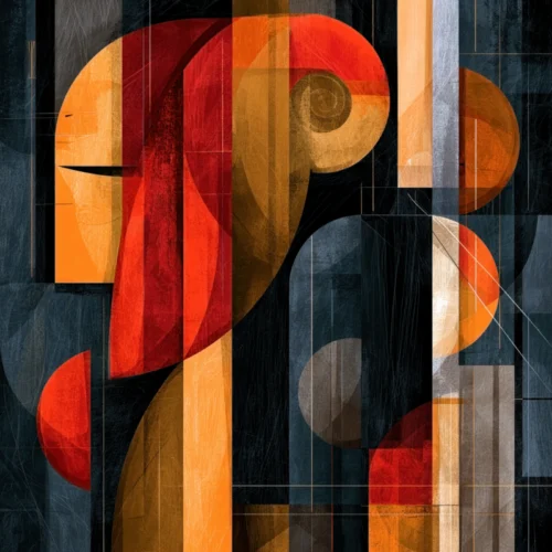
A guest may forget the exact thread count of the sheets or the name of the cocktail, but they remember the moment a lobby wall stopped them in their tracks. A burst of saturated color behind a reception desk, a quiet floral composition at the end of a corridor, or a monumental multi-panel work above a banquette can become part of a stay’s emotional afterimage. The most compelling hospitality art design trends recognize that art is not a finishing touch. It is a source of atmosphere, identity, and memory.
For hotels, restaurants, spas, and other guest-centered interiors, the question is shifting from “What should go on this wall?” to “What should this room make someone feel?” The answer is rarely generic. It is shaped by the property’s setting, its architecture, its audience, and the particular kind of pause it hopes to offer.
Hospitality Art Design Trends Are Becoming More Personal
Hospitality interiors are leaving behind the era of anonymous, safe artwork selected simply to fill square footage. Guests have grown more visually literate. They recognize when a room has been assembled from familiar gestures, and they respond when an interior has a point of view.
This has created renewed interest in artist-driven work with a visible hand, a distinct visual language, and enough depth to reward a second look. Photography, especially when reimagined through digital transformation, is especially resonant here. It offers a trace of the real world while moving beyond documentation into mood, rhythm, texture, and imagination.
A work rooted in a flower, a shoreline, a city reflection, or a fleeting figure can feel familiar at first glance. When that image is refracted through color and expressive manipulation, it becomes less about the literal subject and more about sensation. That balance is valuable in hospitality spaces, where art must be immediately inviting while retaining the ability to surprise.
The strongest collections also resist a one-size-fits-all idea of local relevance. A property does not need predictable landmarks on every wall to convey a sense of place. It can suggest its environment through the colors of a regional landscape, the luminosity of water, the density of an urban evening, or the botanical character of a climate. Interpretation often creates a more enduring connection than illustration.
Scale Is Doing More Than Making a Statement
Large-format art remains central to contemporary hospitality design, but scale is no longer used only for spectacle. It is being used to establish visual calm, direct movement, and give expansive architecture a human pulse.
In a lofty lobby, one commanding work can anchor the room more effectively than a scattered arrangement of small decorative pieces. Near elevators or at the end of a long passage, art can provide a moment of orientation. In intimate dining rooms, a tightly composed work with rich detail can invite closer attention and soften the sense of enclosure.
Diptychs and triptychs are particularly effective because they introduce a measured rhythm across a wall. Their divisions can echo the proportions of windows, arches, panels, or seating zones. They also allow an image to unfold rather than announce itself all at once, creating a subtle sense of motion as guests move through the space.
There is a trade-off. Oversized art can overwhelm a room that is already full of strong architectural materials, dramatic lighting, or patterned textiles. In those settings, a quieter palette or a more spacious composition may carry greater authority. Scale should amplify the architecture, not compete with it.
Color Is Becoming an Emotional Wayfinding System
Color has always influenced hospitality interiors, yet current design thinking treats it with greater intention. Rather than using art merely to repeat the accent colors in upholstery, designers are choosing works that shape the emotional temperature of a space.
Deep blues, shadowed blacks, and reflective silvers can lend a lounge or guest-floor corridor a sense of retreat. Luminous botanicals, vivid coral, and energetic layered hues can bring life to arrival spaces, restaurants, and creative gathering areas. The objective is not constant stimulation. It is contrast between moments.
A hotel may begin with a bright, expansive visual gesture in the lobby, then transition to more contemplative artwork in guest rooms and wellness areas. A restaurant can use expressive color to create a sense of anticipation at the entrance, followed by more intimate works near tables. These shifts help a property feel composed rather than uniformly branded.
Art also allows color to appear with more nuance than paint alone can provide. A single image may hold dozens of tones, softened by texture, movement, and light. That complexity gives designers flexibility when materials evolve over the life of a property.
Texture, Motion, and the Return of Visual Depth
Flat, overly polished imagery can disappear in a space designed for constant sensory activity. One of the most meaningful hospitality art design trends is the preference for work that has visual depth: images that suggest atmosphere, movement, or accumulated marks rather than a single clean surface.
This does not mean every piece must be visually loud. A blurred blossom against a dark field, a layered abstract with a veil of light, or a photograph transformed into painterly color can have a quiet intensity. These works hold the eye without demanding it.
Texture is especially valuable in contemporary interiors that rely on stone, glass, metal, and sleek upholstery. Those materials can be beautiful, but they benefit from art that introduces an element of softness, irregularity, or mystery. A vivid impressionistic image can provide this counterpoint while maintaining a refined, gallery-caliber presence.
The relationship between lighting and art deserves equal care. Daylight will reveal one character in a work, while evening illumination may deepen another. Before final placement, consider glare, viewing distance, and the changing path of light through the room. Artwork that is beautifully selected but poorly lit loses much of its expressive force.
Curated Cohesion Beats Repetition
A hospitality property needs continuity, but continuity is not the same as repeating the same image in every public area. The more sophisticated approach is to establish a visual family: related colors, recurring motifs, compatible levels of abstraction, or a shared sense of movement.
A floral collection might move from bold, exuberant compositions in public spaces to darker, more meditative blooms in private corridors. An abstract series might shift in palette from one floor to another while retaining a recognizable visual vocabulary. The result feels intentional without becoming predictable.
This is where a single artist’s body of work can offer unusual value. A cohesive collection carries its own internal conversation. The images may vary in scale, subject, and intensity, yet they remain connected by a distinct eye. For designers, that continuity can make a large property feel more personal. For guests, it creates a visual thread that gradually reveals itself during the stay.
Arthur Jacob Impressions approaches photography in this spirit, treating the captured image as a beginning rather than an endpoint. The resulting works carry the energy of observed reality while becoming something more lyrical and transformed, suited to interiors that want art to resonate beyond decoration.
Guest Rooms Need Art With Staying Power
Public spaces can accommodate greater drama because guests pass through them quickly. Guest rooms require a different calibration. Art should provide character without creating visual fatigue, especially when it faces the bed or occupies a compact wall.
This is not an argument for blandness. A guest room can hold a powerful work, particularly if the composition has breathing room or the color carries a restorative quality. But the image should invite return. Details that emerge gradually, a calm field of color, or an evocative subject interpreted with restraint can give the room a more lasting presence.
The same principle applies to wellness spaces. Art there should not be reduced to generic serenity. A piece can be sensual, vivid, or emotionally layered while still supporting reflection. The best choices feel alive rather than merely soothing.
Designing for the Photograph Without Designing Only for It
Hospitality spaces now live two lives: the physical experience and the image guests carry away on their phones. Art can create a compelling visual moment, but designing exclusively for instant photographs risks producing an interior that feels thin in person.
The more enduring goal is art that works from every distance. It should read clearly from across a lobby, reveal texture and complexity from nearby, and feel natural within the room rather than staged for a backdrop. When this happens, guests may share it because it moved them, not because it asked to be shared.
A memorable hospitality interior does not need to shout. It needs a visual point of view strong enough to be felt. Choose work that carries color with conviction, meets the architecture at the right scale, and leaves room for a guest’s own interpretation. That is how a wall becomes part of the story someone takes home.
Leave a Reply