
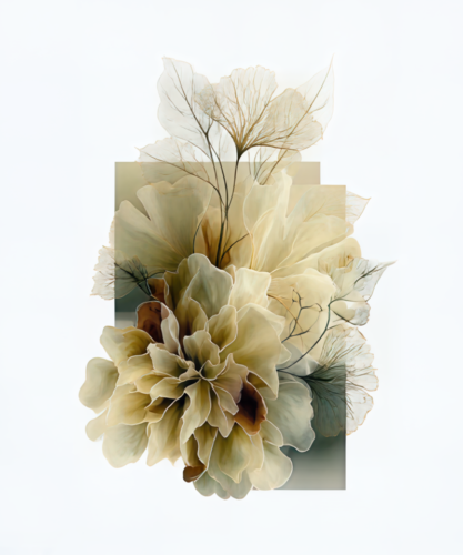
A room can be beautifully furnished and still feel unresolved. Often, the missing element is not another object but an image with enough presence to gather the room around it. The best art prints for designers do more than fill a measured wall. They introduce atmosphere, establish rhythm, and give an interior its emotional center.
For designers, art selection is an act of composition. A print must honor the architecture, converse with materials, and remain compelling after the project photographs have been taken. It should feel particular to the space, never like a decorative afterthought. The most enduring choices are works that balance visual confidence with a capacity for interpretation.
Best Art Prints for Designers Begin With Visual Authority
A successful print does not need to explain itself immediately. It needs to hold the eye. That authority may arrive through saturated color, a striking contrast of light and shadow, a graceful gesture, or a surface alive with texture. In a refined interior, art becomes a visual counterweight to upholstery, stone, wood, metal, and glass.
Photography transformed through a painterly sensibility is especially compelling in this role. It retains the sensual evidence of the observed world while moving beyond documentation. A flower becomes an eruption of color. A city fragment becomes a field of abstraction. A moment in motion becomes a lingering impression. This shift from record to reinterpretation gives a room something to return to.
Designers should look for prints with a clear point of view rather than images that merely repeat the palette already present. A quiet, tonal room can absorb a vivid blossom on black with remarkable elegance. Conversely, a sculptural interior with expressive furnishings may call for a more restrained abstract, one that offers depth without adding visual noise.
Choose Art That Creates a Focal Point, Not a Theme
There is a difference between coordinating and curating. Coordinating often means selecting art that matches a sofa, rug, or accent color exactly. Curating asks a more interesting question: what feeling should this room leave behind?
A print with cobalt, ember, or deep crimson may sharpen the atmosphere of a neutral living room, even when those colors appear nowhere else. A luminous floral can soften a rigorous contemporary dining space. An abstract work can bring ambiguity and air to a room defined by clean lines. The relationship need not be literal. In fact, a little tension is often what makes an interior feel finished.
The same principle applies in professional settings. A hospitality lobby benefits from art that creates an immediate sense of arrival. A private office may need a work that invites contemplation without becoming passive. In each setting, the print should carry a mood strong enough to be remembered, yet open enough to live with over time.
Scale Is Part of the Artwork
Even an exceptional image loses force when it is undersized. One of the most common failures in wall art selection is treating scale as a final detail instead of a primary design decision. Before considering the subject, consider the wall as a field of proportion.
Above a sofa, credenza, or bed, a print should have enough visual width to relate to the furniture beneath it. A small piece centered over a broad sectional can appear isolated, however beautiful the image may be. In a tall entry or stairwell, vertical works can draw the eye upward and make the architecture feel more intentional.
Large-format art creates a different kind of experience. Details become perceptible from a distance, and color can shape the mood of an entire room. It is often the right choice for open-plan interiors, reception areas, and spaces with strong natural light. Yet bigger is not automatically better. In an intimate library, powder room, or quiet bedroom corner, a smaller print can create the feeling of a discovered treasure.
Diptychs and Triptychs Give a Wall Rhythm
Multi-panel works are particularly useful when a single image needs to occupy a generous wall without becoming monolithic. A diptych can create a measured pause between two connected visual moments. A triptych introduces cadence, allowing color and movement to unfold across the room.
These works are not simply one image divided for convenience. At their best, the spaces between panels become part of the composition. They echo the intervals in architecture: window mullions, wall reveals, shelving, and doorways. This makes them especially effective in contemporary homes and commercial interiors where structure and negative space are already integral to the design language.
When placing multi-panel art, preserve breathing room between panels and align the group as one visual unit. The result should read as an intentional gesture from across the room, then reveal distinct relationships as the viewer moves closer.
Let Color Carry the Emotional Register
Color is often the first language a room speaks. It can cool a sun-filled space, deepen a dramatic one, or bring vitality to an interior built in quiet neutrals. But color in art should be evaluated not only for its decorative compatibility, but for its emotional temperature.
Blues, smoky violets, and silvery grays can introduce stillness and reflection. Golds, corals, and rich pinks bring warmth and movement. Deep blacks lend definition, making bright forms appear more luminous and more deliberate. Floral imagery against a dark ground, for example, can feel both romantic and commanding, particularly when surrounded by pale walls or minimal furnishings.
For a layered result, repeat one or two colors from the artwork in discreet elements elsewhere in the room: a ceramic vessel, a book spine, a textile edge. Avoid repeating every hue. Art deserves room to remain the source rather than becoming a color chart for the entire scheme.
Subject Matters, but Sensibility Matters More
Designers often begin with subject: abstract, floral, landscape, architectural, or figurative. This is useful shorthand, but the deeper consideration is sensibility. Two floral prints may create entirely different interiors. One may feel delicate and traditional; another may be energetic, fragmented, and contemporary. Two abstracts may differ in mood as greatly as a whispered line and a full orchestral chord.
Abstract works are often favored for their flexibility. They can bridge periods, soften the boundaries between styles, and invite changing interpretations. They are well suited to rooms where the furniture already makes a clear stylistic statement. Florals and blossoms offer another kind of versatility. When rendered with dramatic scale, dark grounds, or gestural digital manipulation, they move far beyond conventional botanical décor.
Memory-inflected imagery can be especially powerful in residential settings. These works suggest place, motion, weather, or a fleeting encounter without insisting on a single narrative. They lend a personal, almost cinematic quality to a space. The best choice depends on the client, the architecture, and the desired pace of the room.
Consider the Viewing Distance and Light
Art is experienced in motion. A piece encountered from the far end of a hall needs a confident silhouette and clear tonal structure. A work placed beside a reading chair can reward close viewing with layered detail, subtle texture, and unexpected marks.
Light changes this experience throughout the day. Strong daylight can amplify vivid color and reveal surface nuance, while evening illumination can intensify contrast and make darker works feel especially atmospheric. Before finalizing placement, observe the wall at several hours. A print that feels perfect under a single overhead fixture may need a more considered lighting plan to show its full character.
Framing also shapes perception. A minimal frame can preserve the immediacy of an expressive image, while a more substantial profile can give presence to a smaller work or connect it to traditional architectural details. There is no universal answer. The frame should support the artwork and the interior without competing for attention.
Make Space for the Unexpected
The finest interiors rarely reveal every decision at once. They contain a measure of surprise: an intense image in a quiet room, a lush floral in a tailored setting, an abstract print that seems to change with the hour. This is where artist-driven work distinguishes itself from generic wall décor. It brings a living visual intelligence into the room.
Arthur Jacob Impressions approaches photography as material for transformation, allowing color, motion, and texture to become expressive form. For designers seeking artwork with both decorative versatility and a distinct artistic signature, that approach offers more than an image for the wall. It offers an atmosphere that can shape the way a space is felt.
Choose the print that makes the room pause for a moment. That pause is often where a carefully designed interior becomes memorable.
Leave a Reply