
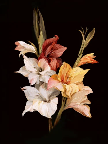
A flower set against black does not simply become more visible. It becomes theatrical. Petals seem to emerge from silence, color gathers intensity, and familiar botanical forms take on a more intimate, almost cinematic presence. The best black background floral prints use this contrast to turn a wall into a point of emotional focus – an experience rather than an accessory.
For collectors and design-minded homeowners, this kind of art offers a rare balance: it can feel lush without becoming sentimental, dramatic without overwhelming a room, and contemporary while remaining connected to the enduring visual language of flowers. The black field is not empty space. It is an active part of the composition, giving each bloom room to breathe, glow, and reverberate.
Why Black Background Florals Hold a Room
Floral art has always carried a sense of life, season, and memory. Against a pale background, those associations can feel airy and decorative. Against black, they become more concentrated. A crimson peony, a white blossom, or a sweep of violet petals is no longer merely pictured. It appears illuminated, suspended, and heightened by the surrounding darkness.
That visual tension is what makes black background florals so adaptable in refined interiors. They can anchor a quiet neutral room, deepen a space filled with natural materials, or introduce a striking counterpoint to clean-lined contemporary furnishings. In a foyer, they offer an immediate sense of arrival. In a dining room, they create atmosphere without competing with conversation. In an office or hospitality setting, they bring warmth and individuality to an environment that might otherwise feel overly controlled.
The effect depends on more than the flower itself. Scale, color saturation, negative space, and the artist’s treatment of motion all influence whether a print feels meditative, romantic, energetic, or sculptural. The strongest works understand that darkness is not a backdrop to be filled. It is a compositional force.
What Defines the Best Black Background Floral Prints
The best black background floral prints do not rely on contrast alone. They create a relationship between bloom and shadow that feels intentional from across the room and rewarding at closer range.
Color that feels illuminated
Color against black can become exceptionally vivid, but intensity needs restraint. Look for petals that appear to hold their own light: deep fuchsia, coral, scarlet, amber, cobalt, or cream can all be compelling when their tonal variation remains visible. A print with too little tonal detail may read as flat from a distance. One with carefully modulated color has dimension, allowing the eye to travel through veining, softened edges, and folds of petals.
This is particularly powerful in photographic work that moves beyond straightforward documentation. When the lens-based image is reimagined through digital manipulation, color can behave more like pigment or stained glass than a literal record of the garden. The result can feel recognizably botanical while also entering the realm of visual impression.
A composition with presence
A single oversized flower can possess the gravity of a portrait. Cropped petals that extend beyond the frame can make the image feel immediate and immersive. A gathering of blossoms, by contrast, can establish rhythm and movement across a wider wall.
Neither approach is inherently better. A solitary bloom often suits a smaller, more contemplative setting such as a bedroom, reading corner, or intimate entry. A denser composition can animate a large living area, restaurant wall, or reception space. What matters is that the arrangement feels deliberate, not merely decorative. There should be a clear visual center, even if the image is intentionally fluid.
Texture and expressive interpretation
Fine art floral prints become especially memorable when they preserve the sensual complexity of the subject. A flower is never only its outline. It is translucence, softness, fracture, repetition, and movement. Consider work that lets texture remain visible, whether through photographic detail, layered color, painterly blur, or a dreamlike dissolution of the original image.
Arthur Jacob Impressions approaches botanical imagery as a starting point for transformation. The flower can remain rooted in reality while becoming more lyrical, more energized, and more emotionally open through an artist’s intervention. That distinction matters for collectors seeking work with a point of view rather than a generic floral motif.
Choosing a Floral Print for the Light in Your Space
Black-background art responds beautifully to light, but it does ask for thoughtful placement. In a room with strong daylight, its darker areas can appear rich and velvety while the colors shift through the day. In low light, vivid blooms can offer a jewel-like focal point, especially when the artwork receives gentle, directed illumination.
Avoid treating the black ground as though it will disappear into every dark wall. On charcoal, navy, forest green, or black paint, the image can feel immersive and sophisticated, but its outer edges may soften. This can be exactly the right effect when the goal is a gallery-like mood. A lighter wall, meanwhile, creates a crisper visual boundary and makes the work feel more graphic.
The surrounding palette also changes the emotional register. A floral print with scarlet or magenta notes can bring sensuality to walnut, brass, and velvet. White or pale pink blossoms can cool a room of stone, linen, and pale oak. Blue and violet florals often speak beautifully to slate, warm gray, and leather. Rather than matching every color in the artwork, choose one note to echo elsewhere in the room and let the remaining hues stay surprising.
Scale, Framing, and the Art of Restraint
The instinct to choose a small floral print for a small room is understandable, but it is not always the most powerful decision. A generous single piece can make a compact room feel composed rather than crowded. Its dark field simplifies the visual environment, while the blossom supplies concentrated energy.
For larger rooms, consider whether the wall needs one commanding image or a measured sequence. A diptych can create a pause between related forms, giving the eye a sense of movement. A triptych can carry color across a broad surface while retaining the intimacy of individual panels. This is especially effective above a long console, behind a dining table, or along a corridor where the viewer encounters the work in motion.
Framing should support the image, not compete with it. A slim black frame can extend the visual depth of the background and create a clean, contemporary edge. Natural wood can add warmth, particularly when the room includes organic textures. A more minimal presentation may suit artwork with strong cropping or abundant negative space. The right choice depends on whether you want the print to feel like a window into darkness or an object with a clear physical presence.
Creating a Collected Interior, Not a Theme Room
Because black-background florals are visually decisive, they are strongest when they are allowed to lead rather than repeated too literally. One exceptional work can hold its own among abstract art, ceramics, sculptural lighting, and quieter photography. The connection does not need to be botanical. It can be a shared color temperature, an echo of gesture, or simply the contrast between organic forms and architectural lines.
This is where a floral print becomes more than a seasonal accent. It can carry the same authority as an abstract composition or a compelling portrait. The flower’s familiarity invites the viewer in; its reinterpretation gives the room a more personal visual language.
There is also a useful tension in pairing these works with restrained surroundings. A black-background floral can soften a minimalist interior without disturbing its clarity. In a more layered room, it can provide a deep visual pause amid pattern, texture, and collected objects. The question is not whether the print matches every element. It is whether it introduces a note the room needs: drama, tenderness, color, or depth.
Let the Image Set the Atmosphere
The right floral print is often the one that leaves a lingering impression before you have fully explained why. Perhaps it is the edge of a petal dissolving into black, an unexpected flare of color, or the sensation that the bloom is moving even while perfectly still. Trust that response.
Art with a black ground asks the eye to slow down. Given a place with breathing room and light that honors its color, it can transform an ordinary wall into a moment of quiet intensity – a lasting invitation to look again.
Leave a Reply