
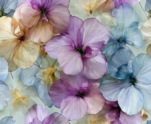
A room draped in a single persuasive color asks for art with enough presence to hold its own. That is the essential appeal of color drenching art trends: walls, millwork, ceilings, furnishings, and artwork are treated not as separate decorative decisions, but as elements within one immersive visual composition.
For collectors and design-minded homeowners, this is not a cue to make everything match. It is an invitation to create atmosphere. A deeply saturated room can become contemplative, theatrical, warm, or electric depending on the color, the light, and the artwork placed within it. The most memorable spaces use art to introduce tension, movement, and a distinct point of view.
What Color Drenching Means Beyond the Paint
Color drenching is often described as painting a room from floor to ceiling in one hue, including trim, doors, and architectural details. That definition is useful, but incomplete. The more artful approach considers the entire room as a field of color, where surfaces recede and visual objects take on heightened significance.
In a pale room, a work of art may be expected to supply the drama. In a color-drenched interior, the walls have already established an emotional temperature. Art then becomes a conversation with that temperature. A luminous floral against a dark wall can seem to emerge from shadow. An abstract in layered blues can deepen a room already wrapped in indigo. A warm, gestural print can interrupt a quiet field of clay or oxblood with a flash of energy.
The result is less about coordination than resonance. The best selections do not disappear into the wall color, nor do they fight it for attention. They create a visual exchange that makes both the room and the artwork feel more intentional.
Why Color Drenching Art Trends Feel So Immediate
The renewed interest in saturated interiors reflects a desire for rooms that feel authored rather than assembled. Neutral spaces remain elegant, but many homeowners and designers are reaching for color as a way to create memory, mood, and identity. A single enveloping hue gives a room an emotional center.
Art amplifies that effect because it brings variation into the field. Texture, contrast, visual motion, and unexpected color shifts prevent a monochromatic room from becoming static. This is particularly compelling with photographic work that has been transformed through digital manipulation. A familiar subject can become less documentary and more atmospheric – a click becoming a vision and impression.
There is also a practical reason the approach resonates. Color drenching can make modest spaces feel deliberate and expansive, especially when the line between wall, trim, and ceiling is softened. Yet the same strategy can bring intimacy to a large dining room, reception area, or hospitality setting. Artwork provides the focal pause: the image that gives the eye somewhere to land within all that color.
Choosing Art for a Color-Drenched Room
A successful pairing begins with the emotional character of the room, not a rigid rule about matching colors. Ask what the space should evoke when someone enters. A bedroom might call for softness and depth. A dining room may invite sensuality and contrast. An office can support a more focused, expansive visual language.
Work with undertones, not just the obvious hue
A forest-green wall may contain blue, yellow, or gray undertones. A blush wall may lean peach, rose, or muted brown. These subtleties determine whether an artwork will feel naturally connected or oddly detached.
Rather than looking for a print that repeats the wall color exactly, seek one that acknowledges its undertone. A blue-green interior may come alive with an abstract carrying pools of teal, flashes of mineral gold, and inky black. A room in rust or terracotta may welcome florals that hold coral, burgundy, violet, or softened cream. The relationship becomes richer when it is felt rather than announced.
Let contrast create the focal point
In color-drenched interiors, contrast is often what gives art its authority. A dark room can frame bright work with remarkable clarity. A vivid print can feel almost illuminated against charcoal, midnight blue, black, or aubergine walls. Conversely, a pale or high-key room can give dark, layered imagery a cinematic intensity.
Contrast need not mean opposing colors alone. It can come from value, texture, scale, or composition. A work with sweeping motion may animate a room defined by flat, matte surfaces. A finely detailed botanical piece can bring intimacy to a broad wall of uninterrupted color. An abstract with velvety gradients can soften architecture with sharp lines.
Consider the frame as part of the composition
The frame is not an afterthought in a saturated room. It is the threshold between the artwork and its surroundings. Black framing can sharpen a vivid image and lend it graphic restraint. Natural wood can bring warmth to jewel-toned or earthen interiors. White or pale framing can create a floating effect, especially against dark walls.
The choice depends on what the room needs. If the wall color is already dramatic, a quiet frame may allow the image to carry the visual event. If the space needs definition, a darker frame can provide structure. In either case, the artwork should feel presented, not merely placed.
The Art of Near-Matching
One of the most sophisticated expressions of color drenching is near-matching: selecting art that shares the room’s dominant hue while introducing enough tonal difference to remain visible. This approach can be serene, immersive, and unexpectedly powerful.
Imagine a plum-colored library with an abstract print in violet, wine, smoky gray, and a touch of silver. The artwork does not break the room’s atmosphere. It extends it. Or consider black walls paired with blossoms that emerge in crimson, ivory, and cobalt. The dark ground creates continuity, while the blooms offer an arresting release of color and light.
Near-matching works best when the artwork has depth. Flat color against flat color can feel lost unless scale or framing creates separation. Images with layered pigment-like texture, softened focus, shadow, or strong gestural form have the dimensionality to hold their place within an enveloping palette.
Where Multi-Panel Art Changes the Room
Diptychs and triptychs are especially compelling within color-drenched spaces because they create rhythm across a wall. The intervals between panels allow the wall color to participate in the image. Instead of functioning as a background, the painted surface becomes part of the composition.
This is a valuable choice for long walls, large entryways, dining rooms, and professional interiors where a single artwork might feel isolated. A multi-panel work can guide the eye horizontally, giving the room a sense of movement and scale. It can also echo the architectural cadence of windows, seating, or a long console.
The spacing matters. Panels placed too far apart lose their visual dialogue; placed too close together, they may read as one compressed image. The wall deserves breathing room, particularly when it carries a saturated hue. That margin of color is part of the experience.
When Color Drenching Needs Restraint
Not every room benefits from maximum saturation, and not every artwork should blend into a monochromatic scheme. Rooms with limited natural light can become heavy if both wall color and art are predominantly dark. In those cases, work with brighter passages, reflective framing, or imagery that carries open space.
Likewise, highly patterned rugs, textiles, and furnishings may already provide enough visual activity. A quieter print with a focused palette can give the room composure. The goal is not to fill every surface with intensity. It is to create a hierarchy so the eye can experience color, architecture, and art in sequence.
A useful test is to stand at the threshold. Does the artwork reveal itself gradually, rewarding a closer look? Or does it vanish entirely? Does the room feel enveloping, or simply crowded? The answer often suggests whether the art needs more contrast, more scale, or more restraint.
Color Drenching Art Trends and the Collector’s Eye
The most enduring color-drenched rooms are built around art that would remain compelling even if the paint changed. Wall color can transform an artwork’s setting, but it should not be the sole reason for choosing it. Look for images with emotional gravity: work that holds your attention through form, texture, movement, and the subtle evolution of color.
Arthur Jacob Impressions approaches photographic and digital artwork as a reinterpretation of reality, where flowers, abstractions, and remembered places become expressive fields of light and sensation. In a room shaped by color, that kind of visual transformation has particular force. The work does not merely decorate the palette. It gives the palette a pulse.
Choose the hue that changes how you feel when you cross the threshold, then let the art introduce the note you did not expect. That is where a color-drenched room becomes more than a trend: it becomes an interior with its own lasting atmosphere.
Leave a Reply