
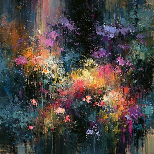
A room can be beautifully furnished and still feel unresolved. Often, what is missing is not another object, but an image with enough presence to gather the space around it. Designer wall art does more than occupy an empty wall. It establishes atmosphere, directs the eye, and gives a room its emotional temperature.
The most memorable interiors rarely depend on decoration alone. They rely on visual decisions that feel intentional: a vivid field of color over a quiet sofa, an abstract composition that animates a restrained entryway, or a dark floral image that lends intimacy to a dining room after sunset. Art has the rare ability to make a space feel finished without making it feel overdone.
What Gives Designer Wall Art Its Presence?
Designer wall art is not defined by a single subject, palette, or style. Its distinction comes from authorship and point of view. The work carries an aesthetic intelligence that extends beyond matching a rug or filling a measured space. It has composition, tension, movement, and a sense of purpose.
This matters because art is experienced differently from décor. A generic print may echo the colors already in a room, but a compelling work can create an entirely new visual conversation. It can bring an unexpected shade into focus, sharpen the architecture of a space, or introduce softness where a room feels too disciplined.
For collectors and design-conscious homeowners, the appeal is often found in this balance: a piece should be visually generous enough to live with every day, yet complex enough that it continues to reveal itself. The image becomes part of the rhythm of the home. It changes with morning light, with evening shadows, and with the passing seasons.
Art That Reinterprets Rather Than Repeats
The strongest contemporary photographic art does not merely document what stood before the lens. It transforms it. A flower can become an explosion of color and gesture. Water can become pure motion. A familiar cityscape can dissolve into luminous fragments that feel closer to memory than place.
That transformation is where photography and digital artistry can become especially expressive. Texture, blur, saturation, layered form, and deliberate abstraction allow an artist to move beyond literal description. The resulting image may begin in reality, but it arrives on the wall as an impression – personal, energized, and open to interpretation.
This is the sensibility behind Arthur Jacob Impressions: work in which a click becomes a vision, and recognizable subjects are reimagined through vivid color, movement, and expressive form. The result is art with a photographic origin and a painterly emotional reach.
Choosing Designer Wall Art by Mood, Not Just Color
Color is a powerful starting point, but it should not be the only one. A room needs more than a coordinated palette. It needs an emotional center.
Before choosing a work, consider the feeling you want the space to hold. A room designed for gathering may benefit from art that feels animated and expansive. A bedroom may call for quieter rhythms, softened forms, or imagery that invites reflection. An office can support bolder visual energy, particularly when the furnishings are spare and the architecture is clean.
Abstract works are often ideal when a room needs atmosphere without a prescribed narrative. They give the eye somewhere to travel while allowing the viewer to bring their own associations. Florals can be equally dramatic, especially when presented at scale or set against a deep black ground. Their familiar subject matter provides an immediate point of entry, while their color and gesture can keep the image from feeling conventional.
Memories-inspired imagery offers a different kind of resonance. These works can suggest places, moments, and sensations without insisting on a single interpretation. They are particularly effective in personal interiors, where a home benefits from art that feels lived with rather than merely selected.
Let Contrast Do Some of the Work
A common instinct is to choose art that blends perfectly into its surroundings. Sometimes that is right. In a restful space, tonal harmony can create a sense of continuity and calm. Yet contrast is often what gives a room its clarity.
A richly colored image can awaken a neutral interior. A dark, dramatic composition can give a light-filled room gravity. Conversely, a luminous print can open a moody corridor or bring lift to a wall finished in deep paint.
The question is not whether the art matches every element nearby. The better question is whether it creates a deliberate relationship with the room. A work that introduces tension in the right measure can feel more sophisticated than one that simply disappears into the palette.
Scale Changes the Entire Conversation
Even exceptional art can lose its force when it is too small for the wall. Scale is not a technical afterthought. It is part of the composition of the room.
Over a sofa, bed, credenza, or reception desk, a single large work can create an immediate focal point. It gives the furniture beneath it a visual anchor and can make the surrounding architecture feel more cohesive. Larger art also allows expressive detail to register from across the room: the sweep of a gesture, the edge of a blossom, the layered complexity of an abstract field.
That said, large scale is not always the answer. A smaller piece can feel intimate and exquisite in a reading corner, beside a doorway, or within a thoughtfully arranged salon wall. The key is to avoid treating wall art as an isolated object. Consider the negative space around it, the sightlines from adjacent rooms, and the distance from which it will most often be seen.
When a Diptych or Triptych Is the Better Choice
Multi-panel art introduces rhythm. A diptych can extend an image across a wide wall while maintaining a sense of air between the panels. A triptych creates a sequence, inviting the eye to move from one section to the next. This makes multi-panel work particularly well suited to long dining room walls, hospitality settings, open-plan interiors, and corridors that need visual momentum.
The spacing between panels is part of the art’s effect. Too much distance can fragment the composition; too little can make it feel compressed. The panels should read as related movements within a single visual statement, with room for the wall itself to participate.
Placement Should Feel Considered, Not Precious
Art deserves attention, but it does not need to be treated like a museum specimen in every interior. The most inviting rooms allow fine art to exist alongside daily life: conversation, books, natural light, dinner, work, and the small rituals that make a space personal.
Hang a primary work where it can be encountered naturally. An entry wall offers a first impression. The wall opposite a bed can create a private moment of reflection. A dining room gives art a social role, allowing it to become part of an evening’s atmosphere rather than background scenery.
Lighting can significantly alter the experience. Natural light reveals color differently throughout the day, while carefully directed illumination can bring forward texture and depth at night. Avoid placing sensitive work where harsh direct sun is constant. The goal is not theatrical brightness, but a clear and respectful presentation.
Give the Room Something to Remember
The art that stays with us is rarely the safest choice. It may be a burst of unexpected color, an image that hovers between photograph and painting, or a composition that seems to shift each time it is seen. It has enough visual confidence to define a room, but enough feeling to become part of the life lived there.
Choose the work that makes you pause before you have explained it. That pause is often the beginning of a lasting relationship with art.
Leave a Reply