
A room can be beautifully furnished and still feel unfinished until the walls begin to speak. This guide to museum-style home artwork is about creating that moment of visual conviction: a space where a single image, or a considered grouping, carries the presence of a gallery work rather than the quiet anonymity of decoration.
Museum style is not about making a home feel formal, untouchable, or overly spare. It is about intention. The artwork has room to breathe. Its color, scale, surface, and framing are chosen in conversation with the architecture. The result is an interior that feels collected, personal, and visually alive.
Begin With the Feeling, Not the Empty Wall
The most compelling art choices begin before dimensions are measured. Consider the emotional atmosphere the room should hold. A living room may call for movement and radiance – an abstract that gathers color into a bold visual current. A bedroom may invite quieter depth: softened florals, shadowed forms, or an image with a meditative field of color. An entryway can sustain more drama, because its purpose is to create an immediate impression.
This is where expressive photography and digital artwork can offer unusual range. An artist’s reimagining of a flower, shoreline, or passing moment can retain a trace of the real while moving beyond description. The image becomes less about what was seen and more about what was felt. That shift gives a work staying power. It leaves room for the viewer’s own memory and imagination.
Avoid choosing a piece solely because it repeats the color of a sofa or pillow. Harmony matters, but literal matching can make art feel subordinate to the furnishings. Instead, look for a work that either extends the room’s existing mood or creates a purposeful tension within it. A saturated blossom against black can bring depth to a pale, quiet room. A luminous abstract can animate a restrained interior without overwhelming it.
A Guide to Museum-Style Home Artwork Starts With Scale
Scale is often the line between artwork that commands a room and artwork that disappears into it. A small print can be exquisite, but on a broad wall above a sofa, bed, or console, it may lose the authority the composition deserves. Museum-style presentation favors proportion that feels deliberate.
For art above furniture, the work or grouping should generally occupy a substantial portion of the furniture’s width. The eye reads the relationship before it reads the image itself. When the artwork is too narrow, the wall can appear fragmented. When it is too large, the composition may feel pressed into the room rather than placed within it.
There is no universal measurement because ceiling height, furniture profile, and surrounding negative space all matter. In a low-ceilinged room, a horizontal work can create a sense of breadth. In a room with vertical architectural lines, a tall composition may draw the gaze upward. What matters is visual weight. Step back from the wall and ask whether the work feels present from the room’s natural viewing distance.
A useful test is to tape the intended dimensions onto the wall before selecting a final size. Live with that shape for a day or two. Notice it as you enter the room, sit down, and move through the space. This simple exercise often reveals whether the instinct to choose smaller came from careful restraint or unnecessary caution.
Let One Work Carry the Room
A single large-scale piece is often the clearest route to a gallery-like effect. It gives the image atmosphere. Details that might be overlooked in a smaller format – a veil of texture, a pulse of color, a blurred botanical edge – become part of the room’s experience.
This approach works especially well when the artwork has an immersive composition. A photographic impression transformed through digital manipulation can hold a wall with the same force as a painting, particularly when color and motion create a sense of depth. The work does not need a crowded room around it. In fact, a measured amount of open wall heightens its presence.
Use Diptychs and Triptychs as Visual Architecture
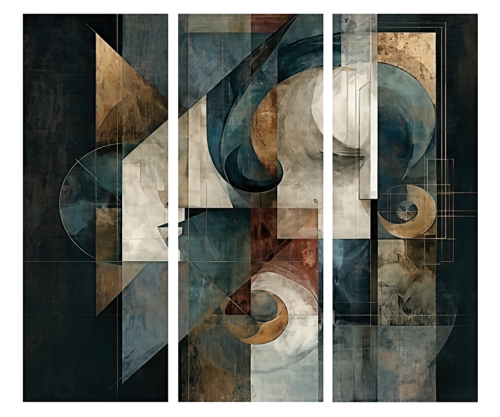
Multi-panel artwork offers another distinctly museum-minded way to shape a room. A diptych can widen a composition across a wall, while a triptych introduces rhythm and progression. These works are more than several images placed near one another. Their intervals are part of the design.
Keep the spacing between panels consistent and relatively close, so the eye experiences them as one visual statement. Excessive separation breaks the relationship between the pieces and makes the arrangement feel accidental. In a dining room, a horizontal diptych can echo the length of a table. Above a bed, a triptych can establish a composed center without relying on a conventional headboard arrangement.
The trade-off is that multi-panel work needs a wall with enough uninterrupted width. It can feel cramped between tall bookcases, windows, or competing decorative objects. Where the architecture is busy, one strong work may offer more clarity.
Frame for Presence, Not Ornament
Framing should support the art’s character rather than compete with it. A refined black, white, natural wood, or restrained metallic frame can give a print architectural definition. The best choice depends on the artwork and the room, not on a rule that every frame must match.
For vivid, gestural images, a clean frame often gives color and movement the space to resonate. A deeper profile can lend gravitas to a large work, particularly in a room with substantial furniture or traditional millwork. For more delicate imagery, generous matting can create a contemplative pause between the art and its frame.
Consider the surrounding materials as well. Black framing can establish a crisp dialogue with iron, dark stone, or charcoal upholstery. Natural wood may soften an interior with linen, oak, and woven fibers. A pale frame can preserve airiness in a sunlit room. The goal is not coordination for its own sake, but a visual relationship that feels quietly resolved.
If you are assembling a salon-style wall, consistency becomes more important. Repeating one frame finish or maintaining a tight family of tones can let varied subjects coexist without visual noise. A salon arrangement has energy, but it should still feel curated rather than accumulated.
Give Art the Light It Deserves
Museum atmosphere depends as much on lighting as it does on selection. Daylight can reveal subtleties in a print, but direct sun may be harsh and can shift the experience of color over the course of the day. Place art where it receives ambient natural light when possible, then use controlled artificial lighting to sustain its presence after evening falls.
Picture lights, adjustable ceiling fixtures, and carefully directed wall washers can bring out texture and tonal range without creating glare. Warm, balanced illumination tends to flatter expressive work and make a room feel more intimate. Aim the light so it reaches the artwork evenly, then view the piece from the seating area. Reflections from glass are often only visible from the exact place where the art is meant to be enjoyed.
Lighting should not turn every wall into a stage set. One illuminated focal work may be enough in a room. In a hallway or hospitality setting, a sequence of gently lit works can create a sense of passage and discovery.
Create Breathing Room Around the Collection
A gallery does not place every work at the same volume. A home should not either. When every wall is filled, even beautiful artwork can lose its individual force. Leave certain walls quiet so the pieces you have chosen can create deeper emotional reverberations.
That restraint is particularly valuable when displaying work with vivid color, layered texture, or pronounced motion. Arthur Jacob Impressions is built around this kind of visual transformation, where lens-based imagery becomes an impression that extends beyond the subject itself. A single expressive piece can often say more than a crowded arrangement of unrelated images.
At the same time, an eclectic collection can be deeply personal when there is a throughline. It may be color, an affinity for botanical forms, repeated black accents, or a shared sense of atmosphere. Let the relationship emerge gradually. A home should feel lived with, not installed all at once.
Hang With a Curator’s Eye
Height determines whether artwork feels integrated into a room. In most settings, the visual center of a work should sit near average eye level. Above furniture, leave a considered, connected distance rather than allowing the art to float too high. The exact placement depends on the height of the furniture and the scale of the composition, but the relationship should feel intimate enough that the artwork belongs to the setting.
Before making the final placement, photograph the wall from across the room. A photograph quickly exposes awkward gaps, off-center alignment, and proportions that are harder to notice while standing beneath the work. It also helps to view the arrangement at different times of day, because light can change the apparent balance of a composition.
The most enduring interiors are not built around rules alone. They are shaped by attention: to the room’s light, to the artwork’s emotional temperature, and to the pause a viewer takes when an image catches the eye. Choose the work that continues to reveal something after the first look, give it the space it asks for, and let the room become a place where vision lingers.
Leave a Reply