
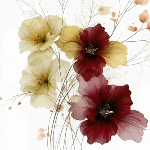
A photograph may begin with a fraction of a second, but fine art begins where simple documentation ends. How are fine art prints made? Through a deliberate sequence of seeing, interpreting, refining, and producing – one that carries an artist’s original vision from the camera or digital canvas into a physical work designed to hold the eye and transform a room.
For collectors and designers, that distinction matters. A fine art print is not defined only by a sharp image or beautiful paper. It is an artwork whose color, texture, scale, surface, and final presentation have been considered as part of a unified visual experience.
The Image Begins as an Artistic Decision
Every lasting print starts with an image worth returning to. For some artists, that image is captured through a lens: a flower caught in changing light, the blur of a moving landscape, a fleeting architectural detail, or a remembered moment reduced to its essential form. For others, it begins digitally, constructed from gesture, color, layered texture, and imagination.
In either case, the raw image is not necessarily the finished artwork. Fine art photography often moves beyond literal representation. A camera records what is present; an artist determines what it means. Through selective focus, framing, motion, exposure, and composition, a familiar subject can become something more elusive and expressive.
At Arthur Jacob Impressions, this transformation is central to the work. A click becomes a vision and impression: photographic source material is reimagined through digital manipulation, allowing color to intensify, forms to dissolve, and movement to become visible. The finished piece may retain a trace of reality, yet it is guided by feeling rather than simple description.
From Source Image to Finished Artwork
The artistic process continues long after the initial capture. An artist may adjust contrast to create depth, build layers that introduce atmosphere, or remove visual distractions so the composition can breathe. Color may be shifted toward richer, more emotional territory. A blossom can become a luminous gesture against black. A city memory can soften into rhythm, translucence, and light.
This stage requires restraint as much as invention. Digital tools offer infinite possibilities, but the strongest fine art prints do not feel overworked. Each adjustment must serve the image’s internal logic. If texture is added, it should deepen the sense of touch or motion. If an edge is softened, it should draw attention toward what matters. If saturation rises, it should heighten emotional resonance rather than overwhelm the room.
The result is a master file: the artist-approved version of the artwork, prepared at sufficient resolution for its intended print sizes. Resolution is essential because it determines how much visual information can be translated onto paper or canvas. A large-scale print needs enough detail to preserve graceful transitions, crisp forms where appropriate, and the subtle tonal shifts that give an image its presence.
How Are Fine Art Prints Made With Accurate Color?
Color is one of the most demanding parts of fine art printmaking. The glow of a vivid floral, the depth of an inky background, and the quiet gradation within an abstract field can appear differently on a backlit screen than they do on a physical surface. Printing is therefore an act of translation, not mere reproduction.
Artists and printmakers use calibrated monitors, color-managed workflows, and test prints to bring the printed image as close as possible to the intended artwork. A monitor creates light; paper reflects it. That difference affects everything from shadow detail to the apparent warmth of a red or the delicacy of a pale blue.
Proofing allows the artist to evaluate the work in its actual material form. A proof may reveal that a dark area has closed up, a highlight has become too stark, or a color needs a slight adjustment to retain its desired intensity. The artist studies the print under considered lighting, then refines the file or printing settings until the image carries the same visual conviction it had in the studio.
This is why a fine art print has a sense of authorship. The artist is not simply sending an image to a machine. They are making decisions about how the image should live in the world.
Paper, Canvas, and Surface Shape the Experience
The substrate is part of the artwork. Fine art papers are selected for qualities such as weight, archival stability, texture, brightness, and the way they receive ink. A smooth matte paper can give an image a velvety, contemplative character. A lightly textured cotton rag can add tactile depth and a more traditional fine art sensibility. A lustrous surface may heighten color and detail, creating a more luminous visual effect.
Canvas offers another dimension. Its woven surface can make an image feel painterly and architectural, particularly when a composition is designed to command attention across a larger wall. Yet canvas is not automatically the right choice for every work. Delicate line, nuanced shadows, and intricate texture may be more faithfully expressed on fine art paper. The best material depends on the image and the atmosphere it is meant to create.
Archival pigment inks are commonly used for museum-style printing because they offer a wide color range and lasting stability when paired with appropriate archival papers. Their value is not simply longevity. Pigment inks can preserve the fine tonal detail that allows a print to feel dimensional: the almost-black blue within a shadow, the whisper of warmth in a neutral field, the layered translucency of petals in motion.
Printing Is Only One Moment in the Craft
Once the final file, ink, and surface have been chosen, the artwork is printed using a professional fine art printing process. The print is then examined closely. This review considers more than obvious flaws. Are the edges clean? Do the deepest tones retain detail? Does the image feel balanced at viewing distance as well as up close? Is the color consistent across the full composition?
For multi-panel works, such as diptychs and triptychs, precision becomes especially important. Each panel must hold its own visual weight while remaining in conversation with the others. The intervals between panels become part of the composition, creating pauses that can amplify rhythm, scale, and movement across a wall.
A fine art print may also be made in a limited edition or as an open edition, depending on the artist’s practice. What matters most for the viewer is clarity of intent and consistent quality. A print should feel like a complete work, not an afterthought or a decorative duplicate of an image that belonged only on a screen.
Presentation Completes the Artwork
The final presentation changes the way art is encountered. A generous white border can create visual stillness around an energetic image. A float mount can emphasize the physicality of the paper. Framing may introduce contrast, warmth, or a crisp architectural edge. Glass or acrylic choices can affect reflection, color perception, and the artwork’s relationship to ambient light.
Scale matters just as much. A small print can reward intimate viewing, revealing texture and nuance over time. A larger work can alter the emotional temperature of an entryway, living room, office, or hospitality interior. Abstracts with expansive movement often thrive at a statement scale, while a more intricate botanical piece may invite a closer encounter.
There is no single correct formula. The strongest choice depends on the work itself, the wall it will inhabit, the surrounding materials, and the feeling a space should hold. A vivid piece may become the room’s pulse. A quieter image may create the necessary pause around it.
What Makes a Fine Art Print Feel Different
The difference is felt before it is explained. Fine art prints carry the evidence of intention: an image shaped by an individual eye, materials chosen for their visual character, colors refined with care, and a presentation that respects the work’s presence.
For the collector, this creates more than wall decoration. It creates a continuing encounter. Light shifts across the surface during the day. Details emerge from a different angle. What first reads as a rush of color may later reveal its structure, memory, or quiet tension.
Choose the print that continues to ask something of your eye. The right artwork does not simply fill a wall. It gives the room a new way to feel.
Leave a Reply