
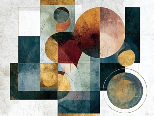
The entryway is the room that speaks before anyone has crossed the threshold. It holds a brief but powerful moment: the pause after the door opens, when a guest senses whether a home feels composed, spirited, quiet, or alive with color. Knowing how to choose art for entryways begins with treating that passage not as leftover wall space, but as the first frame in your home’s visual story.
The right work does more than decorate a foyer. It creates anticipation. A saturated abstract can send energy down a long hall; a floral image against black can make a compact vestibule feel theatrical and intimate. The aim is not to match every object in sight. It is to select an image with enough presence to establish an atmosphere, then let the rest of the interior unfold from there.
Begin With the Feeling You Want to Create
Before measuring a wall or considering a frame, stand just inside your front door. Notice where your eye naturally travels. Is there a direct view into a living room, a stairway, or a narrow corridor? Does the architecture feel generous and light, or contained and shadowed? These conditions shape the kind of visual impression art can make.
An entryway with pale walls and clean lines may welcome a work rich in movement, texture, and vivid color. The contrast can give the room its pulse. In an interior already layered with patterned rugs, architectural millwork, or distinctive lighting, a quieter composition may provide a necessary moment of visual breathing room.
Emotion matters as much as palette. Choose art that reflects the experience you want to offer on arrival. Luminous blossoms suggest warmth and ceremony. An atmospheric landscape or memory-inspired composition can invite reflection. Expressive abstractions often create the strongest sense of momentum, especially in contemporary interiors where a single image must carry the room’s personality.
There is no universal rule that entry art must be cheerful. A dark, moody work can be equally inviting when it has depth, luminosity, or an arresting focal point. What matters is intention. The image should feel like an opening gesture, not an afterthought.
How to Choose Art for Entryways by Scale
Scale is where many otherwise beautiful choices lose their force. Art that is too small tends to drift on a large wall, while art that overwhelms a narrow passage can make the architecture feel compressed. The best proportion is not only mathematical. It is visual: the work should command attention without competing with the act of moving through the space.
For a wall above a console, bench, or entry table, begin with the width of the furniture below. A single piece generally feels balanced when it occupies roughly two-thirds to three-quarters of that width. This leaves a graceful margin on either side and gives the arrangement a deliberate center.
A tall, open foyer may call for a larger vertical work, particularly if the ceiling rises beyond the visual reach of furnishings. Vertical art draws the eye upward and can make an entrance feel more architectural. In a horizontal hallway, a wide composition creates a sense of movement and extends the room’s rhythm.
When one image cannot carry the proportion alone, a diptych or triptych offers a more expansive gesture. Multi-panel art is especially effective in entryways because it introduces cadence: the eye moves from panel to panel before continuing into the home. Keep the spacing between panels consistent and restrained so the work reads as one complete visual statement rather than several unrelated pictures.
Do not assume a small entry requires small art. A compact wall often benefits from one confident piece, rather than a cluster of minor images. Concentrated scale can make a modest space feel curated and memorable. The trade-off is that the work must have clarity from a close viewing distance, since guests will encounter it almost immediately.
Let Color Lead, but Do Not Let It Dictate
Color is often the quickest route to a powerful entryway, but coordination is not the same as repetition. Rather than searching for artwork that duplicates the exact shade of a rug or pillow, look for a piece that enters into conversation with the room.
A work may echo one unexpected tone from elsewhere in the home: the warm brass of a light fixture, a blue-gray door, the green outside a nearby window. That subtle resonance creates cohesion without making the design feel overly arranged. Art can also introduce a new color note that becomes a thread throughout the interior, giving the eye something to discover as it travels from room to room.
Consider the light before committing to a palette. North-facing entryways often receive cooler illumination and may benefit from warm, energized color. A sunny foyer can hold deeper tones, saturated blues, or expressive blacks with remarkable authority. If the entry has little natural light, artwork with contrast and internal luminosity can prevent the wall from receding into shadow.
The most compelling photographic and digitally reimagined artwork does not merely reproduce color. It transforms color into atmosphere. In the work of Arthur Jacob Impressions, lens-based imagery becomes a more expressive visual language through motion, texture, and imaginative reinterpretation. That quality can be particularly resonant at an entrance, where the art has only a few seconds to make an emotional impression.
Consider Sightlines and the Pace of Arrival
Entryway art is experienced in motion. Unlike artwork above a sofa, which is often viewed while seated, it is seen while someone is arriving, setting down keys, turning toward another room, or departing. This changes what works.
A composition with a clear focal area can be compelling from several steps away. Strong contrast, an unfolding line, or a concentrated bloom of color gives the eye an immediate place to land. As viewers move closer, details in texture and form can reward a second look.
Also consider what appears beyond the entry. If the artwork is visible from a living room or dining area, it becomes part of a longer sequence of views. A piece that feels dramatic from the front door may need enough visual sophistication to remain engaging from across the home. Conversely, a work positioned in a tucked-away vestibule can be more intimate, intricate, and surprising.
Mirrors have their place in an entryway, particularly where light is scarce or a wall needs to feel more open. Yet a mirror reflects what is already there. Art introduces a point of view. When the space needs identity more than expansion, an original visual statement often offers greater emotional return.
Frame the Work as Part of the Composition
The frame is not an accessory applied at the end. It is the threshold around the image itself. A slim black frame can sharpen a vivid abstract and bring structure to a loose, lyrical composition. Natural wood may soften a contemporary photographic work and connect it to organic furnishings. White framing can create air around a detailed image, especially against a colored or textured wall.
If the entry is highly traditional, contrast can be effective. Contemporary art in a clean, restrained frame can make historic millwork feel newly alive. In a modern space, a more tactile or nuanced image can keep the interior from becoming overly severe. The strongest rooms often hold a conversation between opposites: precision and spontaneity, dark and light, stillness and movement.
Hanging height matters as much as frame choice. As a starting point, center artwork around eye level, typically near 57 to 60 inches from the floor. But entryways are full of exceptions. If a console sits below, leave enough room for the objects on top to breathe. If ceilings are unusually high, resist the urge to hang art too far upward. A work that floats near the ceiling may be technically centered on the wall but emotionally disconnected from the people entering the room.
Choose Art You Will Want to Meet Again
The entryway is one of the few places in a home you see repeatedly, often at the beginning and end of each day. That is a reason to choose beyond trend. A fashionable color or familiar motif may initially feel easy, but art earns its place through staying power: an image that continues to reveal a gesture, a texture, or a feeling you had not fully noticed before.
Give yourself permission to choose the work that creates a response before you can explain it. The most successful entryway art does not simply announce that the room is finished. It makes arrival feel like an experience, and departure feel like a lingering glance back.
Leave a Reply