
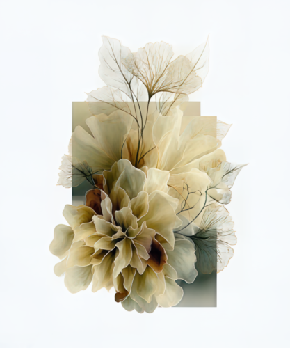
A floral artwork can do far more than introduce a pleasing note of color. It can alter the emotional temperature of a room, soften a severe architectural line, or bring a charged moment of movement to an otherwise quiet wall. Learning how to curate floral wall art begins with seeing flowers not as decoration, but as visual language: expressive forms with scale, rhythm, shadow, and presence.
The most memorable floral arrangements on a wall do not rely on matching frames or an obvious botanical theme alone. They create a conversation between artworks and the space around them. A luminous blossom against black may feel dramatic and cinematic; an abstract floral impression may bring an airy, almost musical energy. The right choice depends on what the room is asking to become.
Begin With the Room’s Emotional Register
Before selecting a single print, stand in the room and consider its prevailing mood. Is it restrained and architectural, layered and intimate, bright and social, or meant for rest? Floral art is remarkably versatile, but its impact shifts with composition and color.
For a serene bedroom, seek floral imagery with softened edges, gentle movement, and a palette that feels like an extension of the textiles and light already present. Petals rendered in misty blues, warm neutrals, or quiet blush tones can create a sense of repose without disappearing into the background.
A dining room or entry, by contrast, often welcomes a bolder gesture. Deeply saturated blooms, intense black grounds, or compositions that seem to burst outward can establish a powerful first impression. In these spaces, floral art can have the authority of a statement piece rather than the sweetness often associated with botanical imagery.
The goal is not to make every color match. A room with too much coordination can lose its pulse. Instead, let the artwork either echo one existing note, such as the green of a chair or the rust in a rug, or introduce a deliberate counterpoint that brings the entire composition into focus.
Choose Florals for Their Visual Character
Not all floral wall art speaks in the same voice. The subject may be a flower, but the artistic treatment determines whether it reads as delicate, contemporary, romantic, sculptural, or electric.
A close-cropped blossom emphasizes form and texture. It can feel almost abstract, especially when the viewer encounters the curve of a petal, the density of a center, or the interplay between light and shadow before recognizing the flower itself. These works are particularly effective in contemporary interiors because they invite a second look.
More atmospheric floral imagery can create a sense of memory or reverie. Here, softened focus, layered color, and digital transformation move the work beyond documentation. The flower becomes an impression – a meeting point between the observed world and the artist’s imagination.
Then there are florals on dark backgrounds. Their contrast gives them unusual gravity. A bloom suspended against black can appear illuminated from within, making it a compelling choice for a hallway, a moody study, or a room that needs visual depth. Such work does not merely fill a wall. It draws the eye inward.
When selecting pieces, ask what the image does beyond depicting a flower. Does it move? Does it glow? Does it hold tension? An artwork with a strong answer will continue to reward attention long after the room is finished.
How to Curate Floral Wall Art by Color and Contrast
Color is often the first point of connection, but it should not be the only one. The most convincing floral art collections use color to create relationships rather than repetitions.
Start with a dominant temperature. A space that leans warm can hold florals in crimson, gold, coral, and rose, yet it may benefit from one cooler note to keep the arrangement from becoming overly predictable. Similarly, a room shaped by cool grays, greens, or blues can gain vitality from a flower rendered in a concentrated red or amber.
Contrast is especially valuable when hanging a single large piece. A vivid floral work against a pale wall has clarity and lift. On a darker wall, a print with bright petals or luminous highlights can create an almost theatrical presence. Neither approach is universally better. Pale walls make color feel expansive, while dark walls intensify drama and intimacy.
For a grouping, avoid selecting every work from the same narrow color family unless the room calls for calm uniformity. A better approach is to establish one thread that repeats across the collection – perhaps a shared undertone of violet, a recurring ink-black ground, or flashes of green – while allowing each piece its own emotional register.
Let Scale Create the Gesture
Scale is where many otherwise beautiful art choices lose force. A small floral print placed alone over a broad sofa or long console can feel tentative, no matter how exquisite the image may be. Conversely, an oversized composition can overwhelm a compact room if it leaves no breathing room around the furniture.
Think of the wall as part of the artwork’s composition. Above a sofa, bed, or credenza, the art should generally occupy enough visual width to feel connected to the furnishing below. It need not match the furniture exactly, but it should not look stranded above it.
A single large floral work is often the clearest solution for rooms that need a focal point. Let it carry the wall with confidence. This is particularly effective when the image has strong gesture, rich color, or an immersive field of petals and texture.
Diptychs and triptychs offer a different kind of drama. Their separated panels introduce rhythm, allowing the eye to move across the wall in a measured sequence. They work beautifully above long furnishings, in corridors, and in hospitality or professional interiors where a single visual statement needs breadth without heaviness. Keep the spacing consistent and restrained so the work reads as one unfolding composition.
Smaller pieces can be compelling in an intimate gallery arrangement, but give them a clear organizing principle. They may share a palette, a subject, a frame treatment, or a common edge alignment. Without one of these anchors, a floral grouping can feel more accidental than curated.
Build a Collection, Not a Bouquet
When combining multiple floral artworks, resist the urge to make them identical. A collection gains sophistication through variation held in balance.
Pair a close botanical study with a more abstract floral composition. Place a quiet, pale work near one with deeper contrast. Let a piece with generous negative space offer relief beside an image rich with detail. These shifts create a visual cadence similar to arranging flowers themselves: fullness, pause, height, and surprise.
Frame choices should support the art without turning every piece into a separate event. A consistent frame finish brings cohesion when images vary widely in color. If the works already share a strong visual language, a more varied presentation can feel collected over time. It depends on whether you want the wall to read as a unified installation or a personal archive of discoveries.
Consider sightlines as well. Art seen from a distance, such as from a living room entry, needs a strong silhouette and color structure. Art viewed up close in a hallway or beside a reading chair can sustain more intricate detail. The same floral image may feel entirely different depending on where the viewer first encounters it.
Give the Artwork Space to Reverberate
Fine art needs a little air around it. Avoid crowding floral prints with shelves, lamps, or decorative objects that compete for attention. If a work carries vivid color and motion, let the surrounding area remain relatively quiet so its visual energy can reverberate through the room.
Lighting matters as much as placement. Natural light can reveal delicate tonal shifts, while directional picture lighting can heighten texture and color after dark. Be mindful of direct sun, which can be harsh on any artwork over time. A thoughtful lighting plan lets floral art change subtly through the day while preserving its clarity.
At Arthur Jacob Impressions, florals are approached as transformed visual experiences rather than simple botanical records. That distinction is useful when curating your own walls. Choose work that feels alive with interpretation, not merely recognizable at a glance.
Let the final arrangement retain one element of surprise: a darker bloom among pale compositions, an abstract work beside a more recognizable flower, or a panel that shifts the rhythm of the wall. That small moment of tension is often what makes a room feel not simply decorated, but deeply and distinctly yours.
Leave a Reply