
A room can have beautiful furniture, generous light, and all the right materials, yet still feel unfinished until color begins to speak from the walls. Learning how to layer art with color is less about matching every hue perfectly and more about creating a visual conversation – one that gives an interior atmosphere, movement, and a point of view.
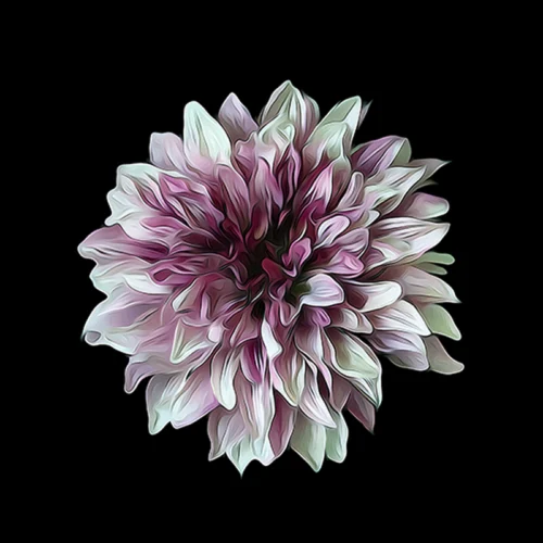
For collectors and design-minded homeowners, art is often the element that transforms a room from arranged to remembered. A vivid abstract can draw out the warmth of a rust velvet chair. A blossom against black can give a pale, quiet room a pulse. The goal is not decoration by formula. It is a layered composition in which color carries feeling from one surface to another.
How to Layer Art With Color Without Overmatching
The most compelling rooms rarely depend on exact color repetition. A painting does not need to reproduce the blue of a rug or the green of a sofa to belong there. In fact, a near-perfect match can flatten the experience, allowing the art to disappear into the scheme rather than animate it.
Instead, look for relationships. A print with cobalt, indigo, and violet may sit beautifully above a camel leather sofa because warm brown makes cool blue feel more luminous. A floral work with fuchsia and coral may resonate with a neutral room when its saturated tones echo the undertones in natural wood, brass, or clay. Color becomes layered when it appears in varied intensities, temperatures, and textures.
Begin by deciding what role the artwork should play. It may be the first strong note in an otherwise restrained interior, or it may gather together colors that already appear in textiles, books, ceramics, and upholstery. Both approaches are valid. The difference is intention: is the art leading the room, or is it deepening a story already underway?
Choose a Dominant Mood Before a Palette
Before selecting individual colors, name the emotional temperature you want the room to hold. A space intended for restoration may call for misted greens, soft blues, charcoal, and muted floral tones. A dining room or entry may welcome higher contrast: black, saturated red, electric blue, or bursts of gold that create instant drama.
This decision protects the room from becoming a collection of unrelated attractive objects. Color has psychological weight. Deep tones can make a large room feel more intimate and deliberate. Bright, kinetic color can expand the energy of a compact space. Pale tones can create air and calm, but they still need contrast somewhere – perhaps in a dark frame, a sculptural object, or a print with a concentrated area of shadow.
Start With One Work That Carries the Room
Layering works best when there is a clear visual anchor. Choose one substantial artwork that carries the room’s central emotion. This may be a large-scale abstract with sweeping color, a photograph reimagined through expressive digital manipulation, or a multi-panel work whose movement unfolds across the wall.
Let this first piece establish the richest part of the palette. Notice not only its most obvious color but also its quieter notes. An image that reads as blue from across the room may contain gray, ink black, silver, lavender, or a small wash of warm amber. Those secondary colors offer a more sophisticated route into the rest of the interior than simply buying blue accents.
A large work can hold a room together even when the surrounding furnishings are restrained. Conversely, in an interior with patterned textiles and expressive architecture, a more spare artwork may provide the necessary visual pause. Scale matters here. If a work is too small for the wall, adding color elsewhere will not solve the imbalance. Give the focal piece enough presence to be felt at the distance from which the room is most often seen.
Build Color in Three Distances
A room gains depth when color appears at more than one visual distance. Think of the wall art as the far plane, furnishings as the middle plane, and smaller objects as the near plane. This is where an interior begins to feel composed rather than merely coordinated.
At the far plane, artwork establishes the room’s horizon line and visual identity. In the middle plane, upholstery, curtains, rugs, or a painted cabinet can repeat one or two supporting tones. In the near plane, books, a glass vessel, a small bowl, or a flowering branch can offer brief flashes of related color.
The colors should not arrive with equal force. If every surface is saturated, the eye has nowhere to rest. Let one element be vivid, another softened, and another almost neutral. For example, a print alive with crimson and magenta may be balanced by a faded rose pillow and a single dark red object on a nearby table. The repetition is there, but it feels discovered rather than announced.
Use Contrast to Give Art Its Presence
Color layering is not only about harmony. Contrast gives art distinction. A luminous print often becomes more powerful against a wall color that makes its light visible. Black and near-black images can feel particularly dramatic on warm white, mushroom, pale gray, or plaster-toned walls, where the dark field reads as a deliberate aperture into another world.
A bright work against a dark wall can be equally striking, though it requires attention to framing and lighting. Dark walls intensify color, but they can also absorb smaller pieces. In this setting, a generous mat, a pale frame, or a larger format may give the work the breathing room it needs.
Do not assume white walls are neutral in every situation. Cool white can sharpen blue and violet while making warm reds feel more forceful. Creamier white softens contrast and can bring coral, gold, and botanical greens into a more relaxed relationship. Paint is part of the composition, not simply the background.
Let Collections Create Rhythm
A single artwork can set a mood. A group of works can create rhythm. This is especially true with diptychs and triptychs, where color and gesture extend across multiple panels. The separation between pieces becomes part of the image, introducing breath, anticipation, and a sense of movement along the wall.
When arranging several works, seek a shared thread rather than identical subject matter. The thread might be a recurring black ground, a similar wash of blue, a repeated curve, or the same emotional intensity. An abstract, a floral image, and an atmospheric photographic piece can coexist if their color language feels related.
Keep the spacing intentional. Closely placed panels read as one larger statement, while greater distance allows each work to retain its independence. There is no universal measurement because the right interval depends on scale, wall size, and the energy of the images. Stand back often. A grouping should feel like a phrase, not a row of separate sentences.
Consider Light as Another Layer of Color
Natural light changes artwork throughout the day. A print that feels cool and silver in morning light may become warmer and more saturated as afternoon sun enters the room. Evening lighting can pull forward deep blacks, rich blues, and the more mysterious details within an image.
This is why color decisions should be made in the room itself whenever possible. Consider where the art will be seen most often: in daylight, under lamps at night, or in the shifting light of a hospitality or professional setting. Direct sun can overwhelm delicate tonal variation, while a poorly lit wall can diminish even a powerful work.
Use focused, warm-white art lighting when a piece deserves to be experienced after dark. The objective is not theatrical glare. It is enough illumination to preserve nuance, reveal texture, and allow the color to remain alive when the rest of the room quiets.
Leave Space for the Unexpected
The finest color relationships often arrive through a small surprise: a saturated orange inside a predominantly blue print, a black frame against a pale wall, or an unexpected floral note near a severe modern chair. These moments keep an interior from becoming too obedient to its palette.
If the room begins to feel overly coordinated, introduce one contrasting element that still respects the overall mood. A deep green can interrupt a field of warm neutrals. A work with a trace of violet can complicate an otherwise golden space. The point is not to disrupt for its own sake, but to create tension that makes the harmony more memorable.
Layer art with color patiently. Live with the first work, notice what it awakens in the room, and let the next choice answer it. The most resonant interiors are not assembled all at once. They are composed over time, as color, light, and imagination learn to recognize one another.
Leave a Reply