
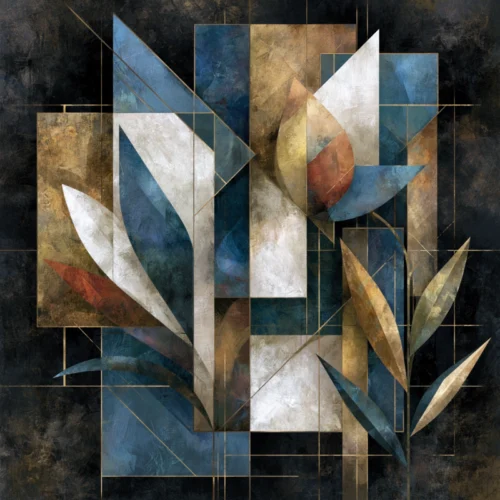
A room becomes more memorable when the eye has somewhere to wander: from the recognizable curve of a petal to a field of luminous color, from a quiet stem to an image alive with gesture. Learning how to mix abstract and botanical art is less about matching subjects than composing a visual conversation. One offers the intimacy of nature; the other introduces mood, movement, and the pleasure of interpretation.
For collectors and design-minded homeowners, this pairing can make an interior feel considered rather than decorated. It allows a floral image to move beyond sweetness and gives an abstract work a point of emotional grounding. The result can be serene, dramatic, or richly layered, depending on the palette, scale, and negative space you choose.
Begin With a Shared Emotional Temperature
The strongest pairings do not need to share the same literal style. They do need to feel as though they belong to the same emotional climate. A photographically based blossom in saturated crimson may sit beautifully beside an abstract of deep black, ember orange, and expressive mark-making because both carry intensity. A pale botanical study and a misty blue abstraction can create a quieter, more contemplative room.
Before considering frames or wall placement, ask what you want the room to hold. Is it energy? Stillness? Romance with an edge? Botanical art often brings a recognizable sense of life and season. Abstract art can amplify that feeling, complicate it, or offer a needed counterpoint. A high-contrast abstract beside a delicate flower can make the flower feel more sculptural. A soft, atmospheric abstract can let a botanical print breathe.
This is where color should serve feeling, not rules. Exact color matching can make a collection feel overly coordinated. Instead, look for an echo: the gold at the center of a bloom repeated as a warm haze in an abstract, or the inky background of a floral carried into a neighboring work through shadow and texture. A shared accent is often enough.
How to Mix Abstract and Botanical Art Through Color
Color is the most immediate bridge between these two visual languages. Start by identifying the dominant color family in the room, then decide whether the art should reinforce it or interrupt it. In a neutral interior, jewel-toned florals and kinetic abstracts can become the room’s visual event. In a space already filled with pattern and color, a limited palette of charcoal, ivory, moss, or muted blush may bring more sophistication.
A useful approach is to choose one lead work and let the other pieces answer it. If the lead is a large botanical print with dark ground and vivid blossoms, select abstract works that repeat its darkness, its brightest note, or its sense of motion. They need not imitate the flower. They only need to appear aware of it.
Black-background botanicals are particularly versatile in this regard. Their dark field can create a dramatic interval between more colorful pieces, much like a pause in music. Paired with an abstract featuring radiant pigment, layered texture, or blurred photographic motion, they feel less traditional and more cinematic.
Be careful with too many competing brights. Several works can be vivid, but they should not all demand the same kind of attention. Let one piece carry the clearest burst of color while the others offer tonal depth, shadow, or a quieter variation of the same hue.
Use Scale to Create Rhythm, Not Symmetry
A mixed art wall benefits from variation. A large abstract can establish atmosphere across a sofa, console, bed, or reception area, while smaller botanical prints bring focus and detail around it. This imbalance is not a flaw. It creates rhythm.
Symmetry can be effective when the architecture is formal or when a room needs calm. For example, two related botanical works may frame a central abstract above a mantel. Yet in more contemporary interiors, asymmetry often feels more alive: a broad, horizontal abstract balanced by a vertical floral print and a smaller companion piece nearby.
The key is visual weight, not identical dimensions. A small image with a black background or intense color can carry as much presence as a larger, pale composition. Stand back several feet and notice where your eye lands first. If every work pulls with equal force, the arrangement may feel tense. If one work leads and the others extend its energy, the wall will feel composed.
Think in Groups of Two and Three
Diptychs and triptychs make this conversation especially persuasive because they introduce intentional pacing. A two-panel arrangement might place an expansive abstract beside a close, transformed view of petals or leaves. The relationship feels immediate, almost like two movements in the same visual sentence.
With three works, avoid making the botanical piece an afterthought. Let it occupy a meaningful position, perhaps in the center as an anchor, or at one end as a point of clarity after two more interpretive images. The sequence should create a shift in perception, from recognizable form into abstraction and back again.
Let Texture Carry the Connection
Botanical art is not only about flowers. It contains veins, edges, folds, pollen, translucency, and the fragile architecture of organic form. Abstract art can meet it through texture: painterly blur, digital grain, layered color, photographic motion, or a softened field of light.
This connection is particularly compelling when the work is not merely documentary. At Arthur Jacob Impressions, lens-based imagery is reimagined through digital transformation, allowing botanical subjects to retain their natural source while moving into a more expressive visual register. That approach makes it easier to place floral imagery alongside abstract work because both are already concerned with sensation rather than simple description.
Consider the finish and material presence of the prints as part of the composition, too. A consistent framing approach can unite diverse images, while varied frames can add character when the room is eclectic. If you choose different frame profiles, repeat at least one element, such as a dark finish, warm metal note, or generous white mat, so the collection still reads as intentional.
Give Each Work Enough Air
Even expressive art needs silence around it. Crowding botanical and abstract pieces too closely can flatten their differences and make the wall feel busy. Leave enough space for each image to establish its own temperature before the eye moves to the next.
This matters especially with richly detailed florals. A close-up blossom may contain more visual information than a broad abstract field, so it often benefits from a little additional breathing room. Conversely, a restrained abstract can act as a visual rest between two botanicals.
The room itself should participate in the arrangement. A vase with sculptural branches, linen upholstery, a lacquered table, or a single dark ceramic object can quietly extend the relationship between organic and expressive forms. There is no need to repeat the artwork literally in the décor. The aim is resonance, not theme.
Choose the Right Mood for Each Room
In a living room or hospitality setting, bolder contrasts can create a sense of arrival. Pair a dramatic floral on black with an abstract work that carries movement and radiant color. The combination gives the wall presence without relying on predictable décor motifs.
Bedrooms often call for a more gradual exchange. Here, a botanical piece with softened petals, muted greens, or washed light can sit beside an abstract with gentle tonal transitions. The work should remain interesting at close range while allowing the room to settle.
For an office, entry, or dining area, consider art that has a stronger directional pull. Vertical stems can lift the eye, while horizontal abstractions widen the perceived space. If the room has limited natural light, a print with luminous color can provide a sense of depth that a purely neutral arrangement may lack.
Trust Contrast When It Feels Intentional
The temptation is to make every element agree. But the most compelling walls often rely on a measured degree of friction: a precise flower against a loose gesture, a dark bloom beside a flooded expanse of color, a quiet botanical countered by an abstract that seems to move beyond its edges.
When the pairing feels slightly unexpected yet emotionally coherent, it invites a second look. Let the botanical work remind the room of the natural world, and let the abstract piece show what that world can become when memory, color, and imagination are allowed to alter the view.
Check out the different collections of original fine art by Arthur Jacob
Leave a Reply