
A small print floating above a generous sofa can make even an exquisitely furnished room feel unfinished. A work with presence changes the entire exchange: color has room to breathe, gesture becomes legible, and the wall begins to carry its share of the composition. The most compelling size trends for wall art are not simply about going bigger. They are about choosing scale with enough intention to create visual atmosphere.
For collectors and designers, this shift is especially meaningful. Artwork is no longer expected to fill an empty rectangle as an afterthought. It is increasingly used as the room’s emotional center: a field of vivid abstraction that charges a quiet entry, a floral work that softens a tailored interior, or a multi-panel composition that gives architecture a sense of rhythm. Size determines how fully that experience arrives.
The New Direction in Size Trends for Wall Art
The strongest movement in contemporary interiors is toward fewer pieces with greater visual authority. Instead of scattering small decorative objects across every available surface, designers are allowing one substantial work to establish a point of view. A large-scale print can hold its own against expansive walls, high ceilings, sculptural lighting, and deeply textured furnishings without competing for attention.
This does not mean every wall needs an oversized statement. The real trend is considered proportion. Art is being selected in response to the furniture below it, the distance from which it will be seen, and the amount of visual stillness the room needs. A luminous, richly colored image may feel perfectly scaled at a moderate size in an intimate bedroom, while the same image needs more physical presence to register across an open-plan living space.
There is also a renewed appreciation for art that reads differently at different distances. From across the room, a large abstract may offer an enveloping surge of color and movement. At closer range, its details, textures, and transformed photographic elements reveal themselves gradually. This layered encounter is one reason expressive, museum-style prints are so well suited to a larger format.
Why Larger Art Feels More Personal, Not Less
Many buyers hesitate before choosing a larger piece because they fear it will dominate the room. Usually, the opposite is true. Art that is too small often calls attention to itself as an isolated object. A properly scaled work becomes part of the architecture, connecting the furnishings, light, and negative space into a more complete visual experience.
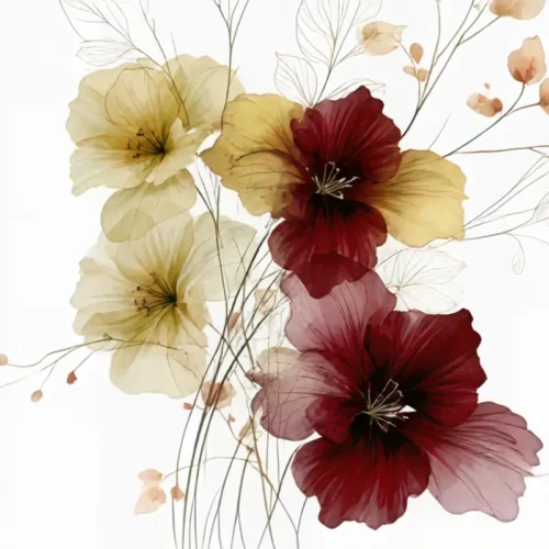
Large work also makes emotional language easier to feel. A blossom set against black, for example, gains a theatrical intensity when its petals and shadows occupy a meaningful portion of the wall. An abstract landscape of color and motion can become less like a decorative accent and more like a changing weather system within the room. The image is not merely seen. It establishes a mood.
That said, scale should never be confused with volume. A restrained work with open areas of tone can bring calm to a room at a substantial size. Conversely, a highly detailed, high-contrast image may need more breathing room around it, even if the print itself is not enormous. The visual density of the artwork matters as much as its dimensions.
Start With the Furniture, Then Read the Wall
When art hangs above a sofa, sideboard, bed, or console, the work should relate to the width of that anchor rather than to the blank wall alone. As a general visual principle, artwork or a grouping often feels balanced when it spans roughly two-thirds to three-quarters of the furniture beneath it. This is not a rigid formula, but it prevents the common problem of a piece appearing visually adrift.
The height of the room matters, too. Tall ceilings invite vertical energy, particularly in stairwells, entryways, and narrow walls between architectural openings. A portrait-oriented floral or abstract can draw the eye upward and give a space a more graceful sense of lift. In a low-ceilinged room, a horizontal piece may emphasize breadth and create a calmer, more grounded feeling.
Before committing, use painter’s tape or sheets of paper to mark the intended dimensions on the wall. Step back to the viewing distance you use most often. Then sit down. A composition that looks ideal while standing may feel too high, too narrow, or unexpectedly timid once the room is experienced as it is actually lived in.
Diptychs and Triptychs Create Scale With Rhythm
Multi-panel art remains a refined answer for walls that need breadth without the visual weight of a single uninterrupted image. A diptych can extend the gesture of one composition across a long dining-room wall or above a wide bed. A triptych adds sequence, allowing color, movement, and form to unfold in measured intervals.
The appeal is not merely practical. Separations between panels create a deliberate pause, much like white space in a painting or silence in music. They give the eye a place to rest while preserving a sense of continuity. This can be especially striking with imagery that has been reimagined through digital manipulation, where a photographic moment expands into something more atmospheric and impressionistic.
Spacing is essential. Panels hung too far apart lose their relationship and begin to read as separate works. Hung too close together, they can feel compressed. A modest, consistent gap allows the wall color to participate in the composition while preserving the work’s internal rhythm. The right distance depends on the scale of the panels and the room, but consistency matters more than chasing a universal measurement.
Gallery Walls Are Becoming More Edited
The gallery wall has not disappeared, but its character has changed. The most persuasive arrangements now feel less like accumulation and more like curation. They often combine fewer works, larger individual images, and a clearer relationship in palette, subject, or visual temperature.
A dense salon-style arrangement can still be beautiful in a collected, traditional, or highly personal interior. It is particularly effective when the goal is intimacy and discovery. But in contemporary spaces, an edited grouping with generous margins often offers more impact. The individual works retain their voices, and the wall feels composed rather than crowded.
For a gallery arrangement, begin with the work that carries the greatest emotional charge. Let it establish the center, even if it is not placed precisely in the middle. Build outward with pieces that echo a color, curve, shadow, or mood from that anchor. A grouping does not need identical frames or matching dimensions to feel cohesive. It needs a visual conversation.
Small Art Still Has a Vital Place
The move toward stronger scale should not erase the intimate pleasures of smaller work. A modest print can be unforgettable when placed where viewing is naturally close: beside a reading chair, within a built-in bookcase, at the end of a hallway, or above a writing desk. In these settings, art becomes a private encounter rather than a room-defining gesture.
Small pieces are also effective in pairs or in quiet clusters. Their power lies in precision. A single jewel-like image on a narrow wall can feel more deliberate than a larger work forced into a space that does not support it. The question is not whether the art commands the entire room, but whether it gives that particular moment a sense of attention.
Let the Artwork Set the Scale of Feeling
Measurements are useful, but they cannot make the final decision alone. Consider what the work is being asked to do. Is it meant to animate a neutral room with color? To lend a lobby, office, or hospitality setting a memorable visual identity? To bring softness and contemplation to a bedroom? The desired feeling should guide the scale.
Arthur Jacob Impressions begins with the belief that a click can become a vision and an impression. When that vision is given the right dimensions, it can alter more than a wall. It can shift the tempo of a room, deepen its color memory, and leave a lasting reverberation in the spaces people return to every day.
Choose the size that lets the image speak at its natural volume. Leave enough space for it to breathe, stand back long enough to feel its pull, and let the wall become part of the artwork’s presence.
Leave a Reply