
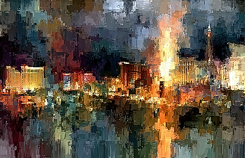
A still wall can change the emotional temperature of a room. The right image does not simply sit in place – it suggests rhythm, light, memory, and movement all at once. That is the particular magnetism of colorful motion wall art: it gives an interior a pulse. For collectors, designers, and homeowners who want more than decoration, it offers something rarer – visual energy shaped with intention.
Unlike static imagery that asks only to be matched with a sofa or paint color, art built around motion asks for a deeper response. It catches the eye first through color, then holds attention through gesture. A sweep of crimson, a blur of gold, a rush of blue across a dark field – these elements can feel almost musical. The room becomes less fixed, less predictable, more alive.
What colorful motion wall art does in a room
Color has always carried emotional force, but motion transforms that force into atmosphere. A vivid artwork with implied movement can make a quiet space feel charged, or lend a formal interior a sense of release. In a home office, it can sharpen focus by adding vitality. In a living room or entry, it can create the first emotional note the space plays.
This is one reason motion-based art resonates so strongly in contemporary interiors. Many rooms today are built from clean lines, restrained palettes, and carefully edited materials. That refinement can be beautiful, but it can also lean cool if nothing interrupts the control. Colorful motion wall art introduces expression without abandoning sophistication. It softens precision with feeling.
The effect depends on the piece. Some works convey motion through layered abstraction, where forms dissolve and reappear like memory. Others rely on photographic origins that have been transformed beyond documentation into something more interpretive. In either case, the best examples do not merely depict movement. They embody it.
The appeal of movement without literal imagery
There is a difference between art that shows an object in motion and art that feels as though motion is the subject itself. That distinction matters. Literal action can be compelling, but it often tells a straightforward story. Suggestive motion leaves room for personal association, and that openness is where emotional resonance begins.
A blurred floral form, a streaked city light, a softened horizon fractured by color – these images are not locked into one reading. They can evoke weather, music, memory, speed, tenderness, or transformation depending on the viewer and the setting. For design-conscious buyers, this flexibility is valuable. The work remains dynamic over time because it continues to reveal itself.
That is also why this category sits so comfortably between fine art and interior design. It has decorative power, certainly, but it also carries interpretive depth. It can anchor a room visually while still inviting reflection. In a gallery-inspired interior, that balance is especially compelling.
Choosing colorful motion wall art for different interiors
Not every space needs the same kind of intensity. A dramatic composition with saturated reds and electric blues may be perfect for a large living room, hospitality setting, or creative studio, while a bedroom may respond better to motion expressed through softer tonal shifts and more fluid forms. The question is not whether the piece is bold. The question is how its energy behaves in the room.
Scale is part of that conversation. Motion tends to read most fully when the artwork has enough presence for the eye to travel through it. A small print can be striking, but expansive pieces or multi-panel arrangements often allow color and gesture to unfold more completely. In open-plan interiors, a larger work can establish visual structure while adding emotional texture.
Placement matters just as much. Over a console, fireplace, or bed, motion-based art becomes a focal point that organizes the surrounding design. In a hallway or transitional space, it can create momentum, drawing the eye forward. For offices and professional interiors, it can project imagination and confidence without feeling overly ornate.
There is, however, a trade-off worth respecting. A room already filled with strong pattern, layered color, and sculptural furniture may not need the most turbulent composition. In those interiors, a piece with controlled movement and a more edited palette may create greater sophistication. When the room is quiet, the art can carry more drama. When the room is visually active, restraint often gives the better result.
Colorful motion wall art as a collector’s choice
Collectors are often drawn to work that offers both immediate impact and lasting complexity. Colorful motion wall art can satisfy both instincts. It announces itself across a room, yet its nuances emerge gradually through repeated viewing. The interplay of blur and detail, light and depth, saturation and shadow creates a visual experience that does not flatten after the first impression.
This is especially true when the artist is not simply recording a scene, but reimagining it. The transformation of photographic material into expressive fine art introduces another layer of meaning. Reality becomes interpretation. The image is no longer evidence of a moment alone. It becomes an artistic statement shaped by sensibility, instinct, and composition.
For buyers seeking work that feels personal rather than generic, this distinction is essential. A mass-produced decorative image may provide color, but it rarely carries authorship in a meaningful way. By contrast, artist-driven work has a point of view. It bears the mark of decision, experimentation, and visual intelligence. That sense of authorship is what gives a piece staying power in a collection.
Arthur Jacob Impressions speaks directly to this space, where photography is transformed into something more atmospheric, painterly, and emotionally charged. The result is art that feels at once contemporary and expressive, disciplined in composition yet rich with sensation.
How designers use motion to shape mood
Interior designers often think in terms of balance, rhythm, and focal tension. Motion-based art supports all three. It can break up the stillness of symmetrical architecture, echo the flow of a curved furnishing, or introduce contrast against hard materials like stone, glass, or metal. In this way, the artwork does not merely decorate the room. It participates in the design language.
Color is the bridge. A print with flashes of amber, cobalt, magenta, or green can pick up subtle notes already present in textiles or finishes, then amplify them into a more expressive register. This does not require perfect matching. In fact, over-coordination can dull the effect. It is often better when the artwork converses with the room rather than mirrors it exactly.
Designers also understand that movement can affect perception of space. Horizontal flow may widen a room visually. Vertical gesture can heighten a wall. Circular or sweeping forms can soften rigid layouts. These are not strict rules, but they are useful instincts. Art changes how a room feels spatially as well as emotionally.
When bold color works best – and when subtlety wins
There is a temptation to assume that colorful motion wall art should always be high saturation and maximum drama. Sometimes that is exactly right. A minimalist room may need a single commanding piece that floods the space with visual life. A commercial lobby or hospitality setting may benefit from art that reads instantly and memorably from a distance.
Yet subtle motion can be just as powerful. Deep charcoals with currents of violet, soft gold drifting through pale neutrals, or floral abstractions suspended against black can create a quieter intensity. These works do not shout, but they reverberate. They suit interiors where mood matters more than spectacle.
The best choice depends on how you want the room to feel at the end of the day. Energized, contemplative, sensual, expansive, intimate – each of these emotional outcomes suggests a different balance of color and movement. That is where selecting art becomes less about filling a wall and more about shaping experience.
Why this kind of art stays with you
Some artworks are admired and then absorbed into the background. Others keep returning your attention. Motion has a great deal to do with that. The eye follows it instinctively, and color deepens the response. Together they create an image that feels active even in silence.
That lasting quality is what makes this category so compelling for refined interiors. It offers beauty, certainly, but beauty with velocity. It turns the wall into something more than a surface. It becomes a field of feeling, a visual impression that continues to unfold with changing light, changing seasons, and changing states of mind.
If a room is asking for more life, more mood, or simply a stronger point of view, the answer is often not more furniture or more styling. Sometimes it is one unforgettable image that moves, even while standing still.