
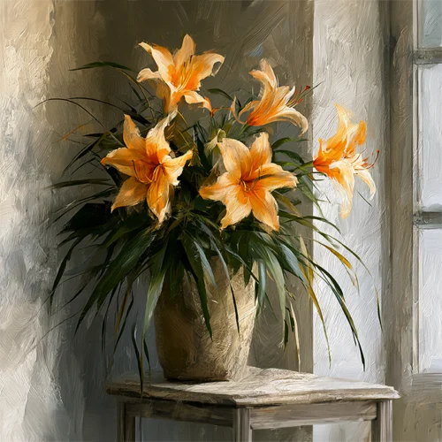
A print can hold the same image as another and still speak in an entirely different voice. Fine art paper texture is part of that voice: the quiet physical character that catches light, softens an edge, deepens a shadow, or gives a field of color the feeling of being breathed onto the surface rather than merely reproduced. For collectors and designers, it is not a minor production detail. It is one of the elements that determines whether art feels present in a room.
Arthur Jacob Impressions begins with imagery transformed through color, movement, and expressive digital intervention. The paper becomes the final receptive ground for that transformation. It gives the visual gesture a tactile counterpart, allowing a photographic source to move beyond documentation and toward an impression that changes with the viewer, the wall, and the light.
Why Fine Art Paper Texture Changes What You See
Texture is often understood through touch, but its first effect is visual. A smooth paper reflects light differently than a softly textured sheet. A pronounced grain can interrupt a perfectly even area of color, while a nearly velvety surface can make tonal transitions appear continuous and atmospheric. Neither quality is inherently superior. The right choice depends on what the work is asking the surface to do.
In a vivid abstract, texture can lend a sense of material energy to sweeping color and layered forms. It may make a radiant red feel less mechanical, or allow a dense blue-black passage to carry a subtle, almost painterly vibration. In floral imagery, it can reinforce the delicacy of a petal or the organic irregularity of a bloom. For a work built around deep blacks, texture may reveal a quiet complexity that only emerges as daylight travels across the print.
This is why paper should not be treated as invisible. Its surface participates in the composition. The image provides the gesture, the color, and the visual rhythm; the paper gives those qualities a place to settle.
Smooth, Matte, and Textured Surfaces
The distinction among paper surfaces is less about labels than about the atmosphere each one creates. A smooth fine art paper tends to preserve crisp transitions and minute details with great clarity. It can be particularly compelling when an image contains precise linear elements, luminous gradients, or intricate digital layers. The result feels clean, contemporary, and intentional, with a visual focus that remains close to the image itself.
A matte surface generally absorbs more light than a glossy one, reducing distracting reflections and giving color a composed, contemplative presence. This matters in interiors with broad windows, directional lighting, or active sightlines. A matte print can remain visually available without turning the room itself into a mirror. Its restraint can also make saturated color feel more sophisticated, allowing intensity to arrive without glare.
Textured fine art paper introduces a more tactile register. Depending on the degree of tooth, it can evoke watercolor paper, handmade fiber, or a softly woven surface. It is especially resonant when the artwork already embraces ambiguity, motion, softness, or the suggestion of paint. Texture can make a photographic image feel less fixed, inviting the eye to linger on the boundary between captured reality and imagined form.
There is a trade-off. A highly textured surface may slightly diffuse the smallest details, so it is not always the first choice for an image whose power depends on microscopic sharpness. Yet for art driven by mood, gesture, and emotional color, that diffusion may be precisely the point. It trades literal precision for a richer sense of atmosphere.
The Role of Light in the Finished Print
Paper texture is never static because light is never static. In morning light, a textured print may reveal gentle relief across pale passages. In the evening, under warmer illumination, dark fields can become more intimate and colors can seem to gather inward. A print viewed from across a room reads as a composition; viewed closely, its surface offers another experience entirely.
This changing quality makes textured paper particularly rewarding in spaces designed for lingering. A living room, reception area, boutique hospitality setting, or private office benefits from art that continues to reveal itself. The work does not need to announce every nuance immediately. It can hold something back, then return it when the viewer moves nearer.
Choosing Texture for the Mood of a Room
The most successful print choice begins with the desired emotional temperature of the space. A room with sculptural furniture, clean architectural lines, and a restrained palette may call for a smoother paper that sustains clarity and polish. Here, color can operate almost architecturally, creating a focused point of visual energy without adding another layer of tactile complexity.
A more layered interior may welcome texture as a connective element. Linen upholstery, natural wood, plaster walls, woven rugs, and ceramic surfaces all carry their own irregularities. A textured print can converse with these materials rather than sitting apart from them. It creates a bridge between the art and the room, preserving the work’s authority while making the overall composition feel considered.
For interiors that need drama, black-ground florals and high-contrast abstractions offer a particularly compelling question. Do you want the surface to feel polished and cinematic, or hushed and tactile? A smoother finish may intensify the graphic force of bright blossoms against darkness. A textured finish can make the same work feel more intimate, as though the color has risen through the paper from beneath.
Scale also matters. Large works are often viewed from several distances, so texture can add a rewarding second level of perception. From afar, the image establishes its emotional field. Up close, the viewer encounters the grain, tonal layering, and physical presence of the print. Diptychs and triptychs gain another dimension here: surface texture can create continuity across panels, helping multiple images read as one sustained visual statement.
Texture, Color, and the Artist’s Intention
Color does not exist separately from surface. On a smooth paper, a saturated hue may appear direct and luminous. On a more textured paper, the same hue may seem softened, broken into subtle variations by the paper’s fibers and tooth. This can be beautiful, but it changes the emotional register of the work.
Consider an image where petals dissolve into washes of crimson, magenta, and amber. A smooth surface may emphasize the glow and contemporary clarity of the color relationships. A textured surface may draw out their organic quality, making the forms feel more like a remembered garden than a literal one. The subject has not changed, yet the experience has.
The same is true of abstract imagery. Works with motion, layered opacity, and sweeping digital gestures can benefit from a paper that gives the eye a place to pause. Texture introduces a gentle resistance to instant consumption. It asks the viewer to look again, not because the image is difficult, but because its surface carries a slower kind of richness.
For this reason, a fine art print should be considered as a complete object, not simply an image selected from a screen. The image is essential, but the finished work is shaped by material choices, scale, framing, placement, and light. Each decision affects how the art enters daily life.
What to Notice Before Selecting a Print
When considering paper texture, begin by imagining the print in its intended environment rather than judging it only in isolation. Notice the light at different times of day. Consider whether the wall is a quiet backdrop or part of a more complex material palette. Think about whether the artwork should deliver immediate graphic impact or reward slow looking.
It also helps to honor your first response. If a particular surface makes the color feel more alive, the composition more spacious, or the image more emotionally persuasive, that reaction is meaningful. Fine art belongs not only to critical language, but to the private recognition that a work has changed the air around it.
The right paper texture does not compete with the art. It gives the image a body, a pace, and a lasting place in the room. Choose the surface that lets the work continue speaking after the first glance.
Leave a Reply