
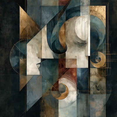
A strong abstract print does not need to explain itself. Its color, motion, texture, and silence can alter the emotional temperature of a room in an instant. To display abstract prints well is to give those qualities room to breathe, allowing the work to become more than decoration. It becomes a visual presence: a focal point, a pause in the architecture, a record of personal taste.
Abstract art is especially responsive to its setting. The same print can feel hushed and contemplative above a linen sofa, electric in a luminous entry, or cinematic against a dark wall. Placement, proportion, framing, and light all shape the encounter. The goal is not to make every surface busy. It is to create a setting in which an image can reverberate.
Begin With the Feeling You Want the Room to Hold
Before measuring a wall, consider the atmosphere already present. Is the room meant to restore and soften, or to energize and provoke? Abstract work is often chosen for color, but its deeper contribution is emotional. A sweeping blur may suggest movement and release. Dense layers of pigment-like texture can bring gravity and intimacy. A field of blossoms or radiant tones may introduce a welcome sense of optimism.
Let the print answer the room rather than merely match it. A neutral interior may benefit from a concentrated burst of saturated color, while a richly appointed space may call for an image with quieter tonal complexity. Harmony does not always mean repetition. Sometimes a measured contrast is what makes an interior feel intentional.
In a living room, look at the artwork from the primary seat rather than only while standing beneath it. In a bedroom, consider the first and last view of the day. In an office or hospitality setting, think about the pace of the space: whether the work should invite reflection, create confidence, or bring a sense of welcome.
Display Abstract Prints at the Right Scale
Scale is the difference between an artwork that commands a wall and one that appears to have drifted onto it. A small print can be exquisite, particularly in an intimate passage, above a writing desk, or within a layered salon arrangement. Yet a broad, open wall often asks for a work with enough visual authority to hold the surrounding architecture.
Above furniture, a useful visual principle is to choose art that occupies roughly two-thirds to three-quarters of the furniture’s width. This is not a rule to apply mechanically. A low, sculptural console can support a more expansive piece; a heavily detailed headboard may call for a cleaner, more contained composition. What matters is the relationship. The art should feel anchored to what sits below it.
Leave space around the work. Empty wall is not unfinished wall. It creates a margin of attention, making color and gesture more vivid. When a print is crowded by shelving, lamps, or competing objects, even a powerful image can lose its force.
For rooms with high ceilings, resist the temptation to hang art too high. The center of a single piece generally feels most natural around eye level, approximately 57 to 60 inches from the floor. In a seating area, the work may sit slightly lower to establish a more intimate connection with the furniture. The best placement is the one that makes the image feel part of the room’s lived perspective.
When One Print Is Enough
A single large-scale abstract print can bring clarity to a room with many materials, patterns, or architectural details. It gives the eye a destination. This approach works beautifully over a sofa, bed, mantel, reception desk, or dining-room sideboard, where the artwork can become the central visual event.
Choose a print with a composition that sustains a longer look. Work shaped by layered photography and digital transformation often reveals itself gradually: a suggestion of landscape, a pulse of light, a fragment of organic form becoming something more imagined than documented. Such a piece offers presence without demanding constant explanation.
When a Pair or Series Creates More Resonance
Diptychs and triptychs bring rhythm to wide walls. Their intervals create a visual breath between panels, while the repeated format lends architecture to the image. They are particularly compelling in dining rooms, long corridors, conference spaces, and above generous seating.
Keep the spacing consistent, usually two to four inches depending on the scale of the panels. Too much distance breaks the conversation between images; too little makes a multi-panel work feel compressed. Treat the full arrangement as one composition when determining its height and relationship to furniture.
A series can also create movement through a transitional space. Rather than filling a hallway with unrelated images, let connected works lead the eye forward through variations in color, atmosphere, or gesture.
Use Color as a Conversation, Not a Formula
An abstract print need not repeat every color in the room to belong there. In fact, a too-perfect match can make art feel secondary to the upholstery. Look instead for a conversation between the work and its surroundings. A trace of cobalt in the print may echo a ceramic vessel across the room. Warm gold might answer the grain of oak. A black-ground floral composition can lend depth to pale walls and draw together charcoal accents without becoming severe.
If you are working with a restrained palette, let the artwork introduce one vivid note. If the room already holds strong color, select a print that offers tonal counterpoint: an image that contains related hues but changes the tempo through shadow, softness, or unexpected light.
This is where abstract art can be unusually generous. It can bridge materials that might otherwise feel separate, such as cool stone and warm wood, crisp metal and tactile fabric. The print becomes the visual field in which those elements meet.
Choose Framing That Protects the Image
A frame should clarify the work, not compete with it. For imagery rich in color and motion, a slim black frame can give the composition definition and graphic edge. Natural wood can introduce warmth and soften more atmospheric work. A white frame may extend the sensation of light, especially around airy, luminous images.
Matting depends on the print and the desired effect. A generous white mat can give a smaller work greater ceremonial presence, inviting the viewer to approach. Full-bleed presentation feels more immediate and contemporary, allowing color to reach the perimeter with confidence. Neither is inherently better. Consider whether you want the image to feel like a contained object of contemplation or a vivid window opening onto the wall.
In a grouping, consistency matters more than uniformity. Frames may vary subtly in size or orientation, but they should share a visual language. Repeating one finish, one mat treatment, or one proportional relationship helps the collection read as deliberate rather than accumulated.
Let Light Change the Experience
Light is part of the display. Daylight can make a print feel alive across the hours, revealing different notes of color as the room shifts. Direct, prolonged sun, however, can be harsh on artwork and should be avoided. Position prints where they receive ambient natural light rather than unfiltered glare.
In the evening, dedicated picture lighting or a well-aimed adjustable fixture can restore the work’s presence. Use warm, balanced illumination that reveals texture and tonal depth without creating a bright reflection across the surface. Test the effect from the usual viewing position, not only from directly beneath the light.
Glossy surfaces and glass require particular attention. If reflections are unavoidable, adjust the angle of the work or nearby lamps before abandoning the placement. Sometimes a subtle shift of a few inches resolves the problem while preserving the composition of the room.
Give the Work a Life Beyond the Wall
The most memorable interiors do not treat art as a finishing touch. They allow it to influence what follows. Once an abstract print is in place, you may notice a new color worth repeating in a pillow, a more sculptural object needed on a nearby table, or an area of blank wall that is finally allowed to remain quiet.
Arthur Jacob Impressions begins with a lens-based encounter and moves beyond documentation, transforming observed reality into expressive visual form. That sensibility belongs naturally in interiors that value imagination as much as coordination. The work can be a bold center, a point of stillness, or a source of unexpected movement.
Live with the piece before making every surrounding decision. The most successful display is rarely the one that announces itself most loudly. It is the one that continues to reveal something as the light changes, the room evolves, and the eye returns.
Leave a Reply